Nonfarm payrolls were up 339k, well above the 190k forecast. At the same time, unemployment rose from 3.4% to 3.7%, well above the 3.5% forecast. How can these two numbers coexist and how does the market decide which one to believe?
The first thing to understand about "the jobs report" is that it is comprised of two separate data collection efforts. One is a survey of regular old people that relies on individual responses (aka "household survey"). The other is a more formal, more systematized reporting of the number of payrolls at various employers (aka "establishment survey").
The unemployment rate is derived from the household survey and nonfarm payrolls (NFP) comes from the establishment survey. In today's data they gave two completely different messages with NFP coming in at 339k vs forecasts calling for 190k and a previous reading of 253k (revised up to 294k). That's a very strong showing.
But unemployment told a different story, rising to 3.7% from 3.4%--a fairly big jump relative to what we usually see.
So who's lying?
These two data collection efforts are absolutely massive. They are also highly regarded in terms of data integrity. In other words, the average investor has complete confidence that the Bureau of Labor Statistics is publishing the exact same data it collects.
Issues arise for a few reasons (sampling error, changes in seasonal adjustment factors, etc), but let's focus on the simple issue of "noise." Sure, NFP was much stronger, but it continues to trend lower.
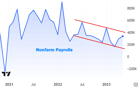
One other way to capture this trend would be to use a moving average:

The chart above begins to clue us in to another big issue for this data: the labor market is still very much in the recovery phase from a truly unprecedented shock. How unprecedented? It's easy to appreciate when we zoom out to include the full scale for the chart above:

In other words, NFP and U/E (unemployment) are still finding themselves after being lost in the woods.
So why is the bond market weaker today if unemployment went higher? That's a simple answer: market participants trust NFP much more than U/E to be a generally better early indictor of broad shifts in the labor market. Charts show why. Take the dot com recession as the first example of NFP clearly leading the way lower well before U/E. NFP bottomed almost 2 years earlier and peaked almost 3 years earlier on the other side of the recession.

Similar patterns hold true for the adjacent economic cycles.


What about some quick and easy explanation for the divergences in today's data? Could it be that an excess of multiple job holders inflated NFP (every job they have counts as a payroll). And could this in turn mean the labor market is weaker than it seems? Probably not. The multiple jobholder category actually tends to rise when things are going well for the labor market, despite all the spin suggesting otherwise.

Moreover, as a percentage of the total, there's not even a clear trend when it comes to multiple jobholders and economic cycles.


