The bond market moved far less over the entire week than it did during a single day last week. Not only was volatility much lighter, but the trading patterns changed as well.
At the onset of the recent panic in the banking sector, stocks and bonds shifted into risk aversion mode. Scary news pushed money out of stocks and into bonds. Promising developments did the opposite. This results in stock prices and bond yields moving with a high degree of correlation (because bond yields move lower when bonds increase in value).
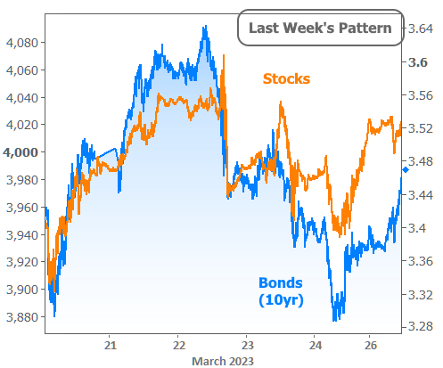
Incidentally, there's your "big day" on March 22nd, when 10yr yields traversed a range between 3.64 and 3.43. Fast forward to the current week (where 10yr yields spent most of their time between 3.54 and 3.58) and there are no signs of that type of correlation.
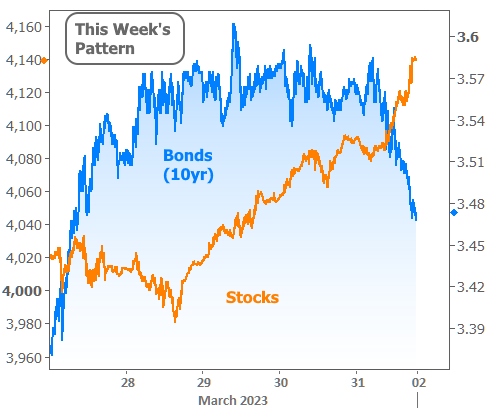
There is largely due to the market finally beginning to calm down and move on from the hypervigilant assessment of banking sector risks. To be clear, this doesn't mean those concerns are gone, simply that this week didn't see the same sort of volatility or deterioration in banking sector sentiment. The following chart shows the percent change in regional bank stocks compared to the S&P. It shows the broader stock market beginning to heal as soon as bank stocks stopped plummeting.

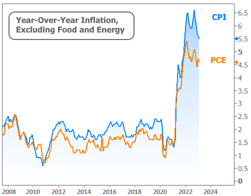
If bank drama continues to fade, the market will increasingly focus on the economic implications, not only of a more cautious banking sector, but also of the high interest rates that are already in place. Those forces combined should put downward pressure on inflation--something that is already showing up in the data, as seen in this week's release of the PCE Price Index falling a tenth of a percent at the "core" level (i.e. excluding food and energy). Along with its more timely counterpart, CPI, both of the two main inflation indices are telling a similar story.
This week's other economic data may not have had an impact on the market, but it's nonetheless relevant to the housing outlook. Pending Home Sales numbers are still historically low, but have risen on each of the past 3 months. That's a big victory for this week's report (which covered the month of February) due to the fast jump in rates seen last month.

Weekly purchase applications, as reported by the Mortgage Bankers Association, confirm that buyers are paying attention to rates. The rate recovery in March has coincided with a recovery in purchase apps.

But the most notable and most confusing housing data released this week would be the duo of major home price indices from the FHFA and S&P Case Shiller. Both indices show prices in apparent freefall when examined in year-over-year terms.
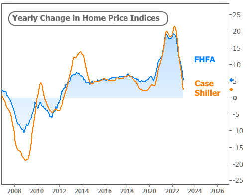
Month-over-month numbers tell a different story. In fact, the broader FHFA index actually moved back into positive territory in January. Case Shiller was down 0.4% but at least that's a slower pace of losses compared to the previous month. And both are well above their moments of steepest declines seen late last year.

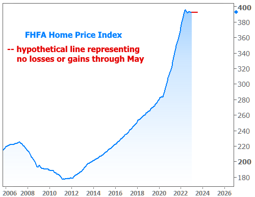
Does this mean home prices are done falling? Yes, actually, if you ask FHFA and base the answer on the current data. A big spike in rates or an unexpected economic shock could change the outlook. All we can truly conclude from the current data is that prices are showing a good level of resilience at this stage whereas such resilience was nowhere to be found the last time monthly home prices surged into negative territory.
On a side note, keep in mind that the year-over-year indices may soon turn negative even if prices don't lose any more ground. Reason being: the price index peaked in May/June of last year and leveled off at slightly lower levels shortly thereafter. Prices would need to move up by roughly half a percent by May to avoid turning negative. Even if prices flat-lined here and didn't move higher, here's what that would look like on a chart.