MND Special Report on MBS "Black Wednesday" Part I
MND Special Report on MBS "Black Wednesday" Part II
The Treasury market has been in absolute disarray this week, as evidenced by the wild bouncing around on Thursday. The yield on the 10-year has bounced between a low of around 3.58% this morning (at around 9:30 a.m. EDT) and a high of 3.75%, before ending the day at 3.62%. Agency MBS have been quite volatile as well. At the 3:00 EDT close, Fannie 4.0s and 4.5s were down in price by almost 5/8 of a point, badly lagging Treasuries for the second straight day, before they recovered and made gains by the time the market closed at 5:00 EDT. Fannie 4.0s in particular have been mercilessly dumped; on Wednesday they underperformed Treasuries by almost a full point, and on Thursday their price bounced in a full one-point range.
There are a number of factors behind the big move in both mortgage and Treasury rates. The biggest, of course, are the fundamentals of a huge budget deficit and enormous Treasury issuance. While the Fed has been trying to support the long end of the Treasury market (through their program of buying longer Treasury securities), investors understand that their buying is small compared to the amount of debt that the Treasury needs to issue. In addition, the large-scale buying of Treasuries by the Fed (by "monetizing the debt") is ultimately inflationary. This prospect has led to warnings by foreign governments (most notably the Chinese central bank) that they don't want the value of their holdings damaged by U.S. policies.
However, there are some technical factors at work weighing on the market. MBS investors had been wary of the impact of rising rates on the "durations" (i.e., the price sensitivity to rate changes) of their portfolios, and had been watching the selloff with growing concerns. At the same time, Wall Street inventories in both longer Treasuries and MBS have been extremely heavy, which led to the dumping of securities once the 10-year yield moved past the 3.40% area. (See the chart below for a time series of Primary Dealer positions in intermediate Treasuries and MBS.) Whether this accumulation was intentional (with expectations of being taken out by the Fed) or accidental, it ultimately led to a "capitulation trade" in which a lot of positions were being liquidated at the same time.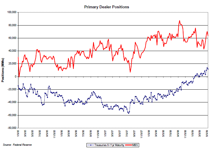
Another factor exacerbating the selloff was the sense that the market was no longer trading in a range, but in the process of establishing a new trading range. The chart below shows the 10-year Treasury yield compared to what technicians call "Bollinger Bands." For the statistically inclined, the bands represent the current rate plus and minus two standard deviations, calculated over a 60-day lookback period. For those revolted by the mere mention of statistical terms, the bands give a general feel for what can be considered a "trading range." When the 10-year yield breaches the rate band (on either the high or low side), the market is considered to be at an inflection point. Most of the time, yields bounce off the bands, maintaining the range; however, when the bands are decisively broken the resulting moves tend to be fast and disruptive, until a new range is established. I'm not a market technician, but I think this is a useful tool in understanding market sentiment and when rates are approaching a danger point.
As one might expect during the selloff, mortgage-backed securities are trading increasingly "long" over the past few weeks. I tend to look at how long or short mortgages are trading by using "empirical" durations, which are calculated by using a linear regression of the change in mortgage prices versus the change in rates. (I know I know-more statistics.) The chart below shows the empirical durations of Fannie 4.0s (which used to be the current coupons, until this week) and 4.5s versus the 10-year Treasury yield. This chart indicates how much the coupons have lengthened over the past month. In addition, the sharp lengthening experienced on Wednesday reflects their massive underperformance in the selloff, amid word of large-scale dumping of positions. A peak at the empirical durations gives a sense of why traders and investors concluded that their mortgage portfolios were lengthening over the past 3-4 weeks. I don't like using empirical durations for actual hedging purposes, but they are useful in providing a sense of how the market is trading different securities.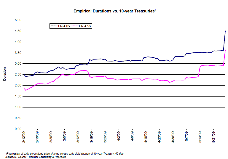
While the market mayhem has attracted the most recent attention, some news related to the housing market has also been released. There are many negative elements to the housing market that one could list: continued increases in delinquencies and foreclosures, a glut of homes for sale, continued price weakness, etc. One thing that hasn't received much attention is the rising affordability of homes, which has resulted from a combination of 1) fairly steady income levels (for those that have jobs), 2) declining home prices, and 3) low mortgage rates.
The most widely quoted measure of affordability is the National Association of Realtor's Affordability Index. The index is calculated like a debt/income ratio; it is calculated by dividing the minimum amount of income necessary to make monthly payments on a median home into U.S. median income. For example, an index of 100 means that median income is equal to the necessary monthly payment on the median home. The measure uses an average national mortgage rate and assumes a 25% coverage ratio (P&I only) and an 80% LTV. While the measure is distorted by a number of factors, it is useful in understanding trends in the housing market.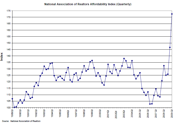
The attached chart shows that the NAR's Affordability Index is (as of the end of the first quarter of 2009) at an all-time high. Keep in mind, however, that the mortgage payment is calculated using a fully-amortizing mortgage payment. In the recent past, the ability to use non- and negatively-amortizing mortgage products gave an artificial boost to affordability. The accompanying chart shows the NAR's affordability index superimposed with separate indices calculated to 1) the average mortgage rate but using an interest-only payment, and 2) the payment on an option ARM using a 1.5% starting rate. 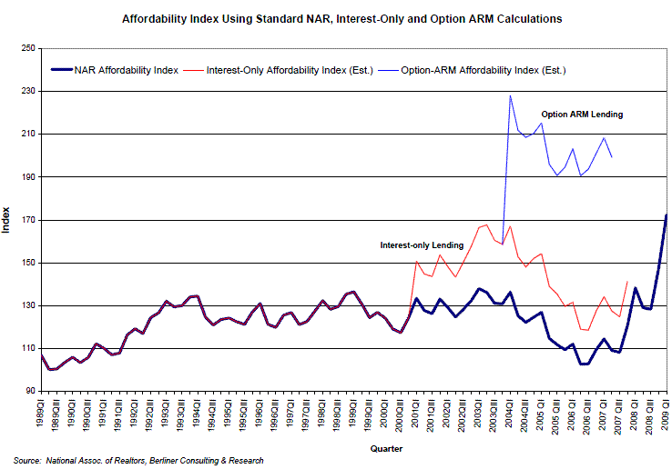
This chart is extremely interesting. It suggests that affordability calculated using traditional mortgage products is only beginning to approach the levels previously available for homebuyers using interest-only loans. (The chart shows the alternative indices through mid-2007. Interest-only loans are still available, but the pricing is fairly unattractive; plus, you'd probably need ten years of bank statements to get a loan.) It also gives a sense of why home prices were able to soar in the period from 2004 through much of 2007. In addition to the widespread use of interest-only products, the availability of option ARMs totally distorted the concept of "affordability." Additionally, the rate assumption has a significant impact on the level of the affordability index, highlighting the sensitivity of the housing markets to rising primary mortgage rates.
Finally, I'd like to take the opportunity to point people to a new web site I'm editing and administering. It was designed to give bond market investors and professionals a place to exchange information, commentary, and research, focusing on all bond markets (including munis, corporates, and money market funds, as well as MBS). Devotees of this web site that are interested in closely following developments in the capital markets may find the new site to be a useful supplement to their intellectual diet. The administrators of Mortgage News Daily have been kind enough to post a link to the site; it can also be accessed at www.fixedincomecolor.com


