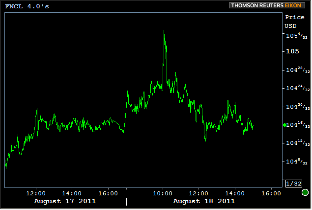
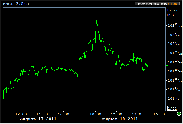
Lots to cover so we'll dig right into it. First of all, it's hard to miss the fact that 10yr notes dipped below 2% today. 10's are still nearly a full point better in price today (9.5 bps in yield) and stocks continue suffering. We'll show you some long and short term technical developments in both of those markets, but first, what about our poor MBS!? They're not rallying to nearly the same extent as longer-dated Treasuries. That much is clear simply by observing the 3 tick gain in Fannie 4.0's and the 4 tick gain in Fannie 3.5s, but why?
This goes back to a concept you may have heard with increasing regularity of late: The Risk-Off Trade. It's as simple as it sounds really. The more dire the macroeconomic situation looks, the more frantically markets search for a SAFE place to put their money. Sovereign downgrade and all, US Treasuries are still the safest. And yes, even though MBS are part of the same bond-market family, and even though they'd normally benefit from risk aversion in a higher proportion, when we have stocks falling as much as they have and 10yr notes rallying under 2.0%, even MBS get passed over for not being "safe enough." And thus we see the spread between Treasury yields and MBS yields widen out. Still, the strength in Treasuries has helped MBS to hold onto yesterday's good gains and MSB remain in all-time high territory. (View: Today's MBS Pricing or Access Live Prices)
4.0's are still in line with yesterday's closing levels.
Since 3.5 MBS have a LONGER LIFE SPAN (less likely to be paid off) than 4.0s, they're more akin to the longer end of the Treasury yield curve. And considering the long end is rallying whereas 2yr notes are actually worse on the day, it stands to reason that 3.5's would be outperforming 4.0's relatively, and indeed they are! Unlike 4's, 3.5's have mostly held ABOVE yesterday's closing levels.
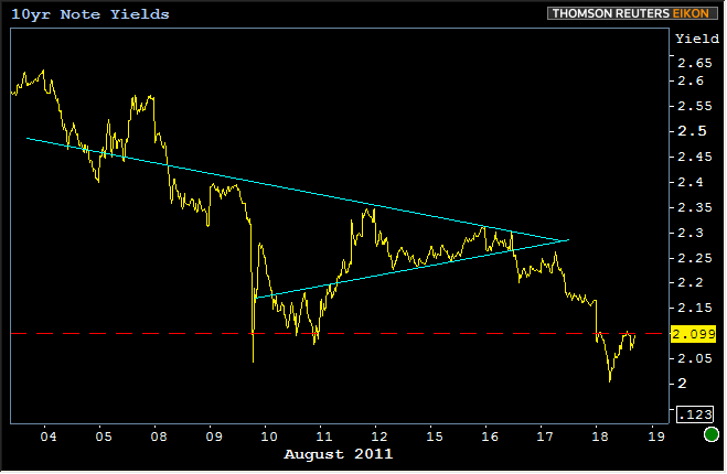
The more this kind of "stuff" happens, the more prominence 3.5's gain as a legitimate market in the TBA-MBS realm. 3.5 origination has ticked up from non-existent to barely-perceptible, but that trend could easily continue given their current relationship to 4.5s YES! It's more about their relationship to 4.0's and their availability in the TBA market than simply about their price being "over par" that dictates whether or not they should be tracked as the most important MBS coupon. Today is really the first day where that price spread has been low enough to justify that. Think of it like the old "lie, rumor, truth" saying. At certain price spreads, the possibility of 3.5's being pertinent to loan pricing is a flat out lie. Recently though, they've entered the "rumor" stage as can be seen on the chart below. This has been the time where lenders may have been originating loans at 4.125 and lower (the highest note rate eligible for 3.5 coupon delivery), and perhaps passing them directly to servicing without putting them up for sale via the TBA market. But they're on the verge of the "truth" sector, in which we will see the TBA production of 3.5's increase further, soon making them the only MBS coupon worth watching for rate sheet indications. We're not quite there yet, but very close:
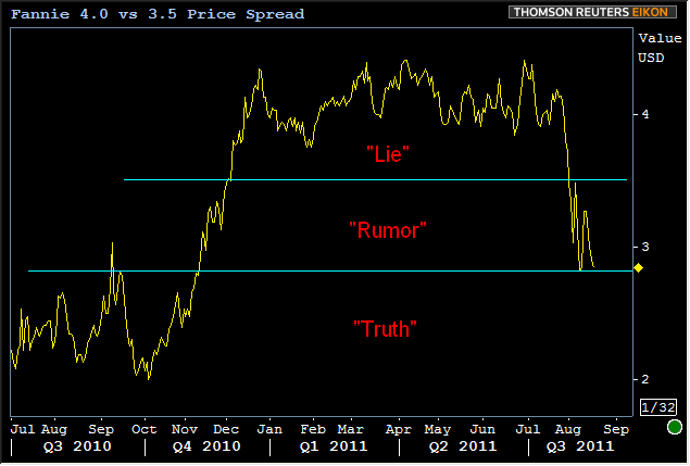
To break into "the truth" sector definitively, it might surprise you to consider that Treasuries wouldn't even need to rally any more. After all, you can see Q310 on the chart above, and of course 10yr yields couldn't have been any lower than they are now! It's all about stability. MBS don't react well to increased risk of volatility in the markets. The less certainty about where things are headed, the riskier it become to hold a security that can vary it's maturity based on how long borrowers want to stay in their loans. We've talked at length about "prepayment risk" in the past, and that's all this really is, just on a much more precipitous scale than gradual changes of the past.
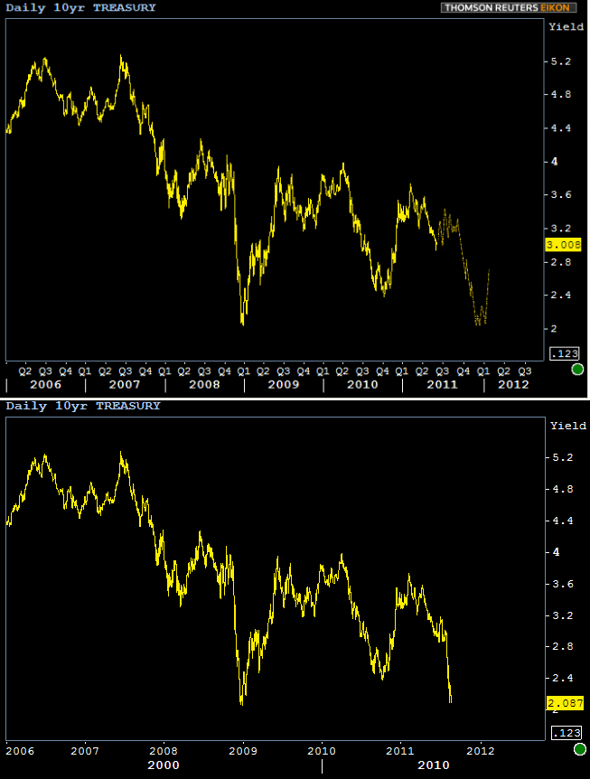
Whether or not underlying markets give MBS the stability it needs to tighten the gap to Treasuries remains to be seen. If history continues to repeat itself, as it has done an astounding job of so far this year, 3.5's might not be on the table for more than a few months. Here's the "then and now" comparison between our hypothetical 10yr yield chart from the beginning of June and today's update of the same chart:
You can see the expected period of choppiness is behind us and the actual move down to 2.0 happened a bit faster than we'd entertained. But still, a striking turn of events, and an eerie reminder on the potency of technical analysis in uncertain markets. Case in point, although it can't really be seen on the above chart due to scaling, 2.10 was a fairly clearly suggested technical level that we thought 10yr yields might test after they broke positively through a recent "triangle." Below is a chart of that triangle as well as the 2.10 level. You can clearly see how markets are treating that level as technical support today:
Here's a bit of a zoomed in view of today only so you can see just how TECHNICALLY 10yr notes are trading:
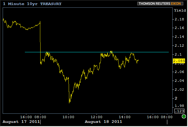
Whether or not upcoming weeks and months turn out to contain a move back higher into the 2's or whether "something different" happens, will largely depend on stocks. Treasuries are certainly paying attention to stocks these days and stocks are exhibiting technical behaviors of their own, both in the long and short term. Today for instance, stocks contended with a triangle of their own and their inability to break the upper line is one way of looking at why 10yr yields were able to hold their line at 2.10.
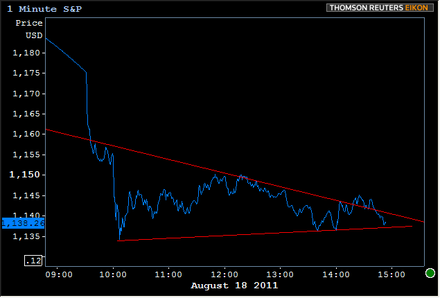
That's just a very short term example of how technical developments in one end of the market can affect another. But big swings and epic movement like we've seen is best-suited for long long long term analysis. To that end, we'll leave you with the following consideration. We know bonds are paying attention to stocks, and stocks are now faced with a a choice. Even if we concede that the LONG term trend in stocks has been a gradual uptrend, S&P's could still fall to the next rung of support seen in the following chart of upwardly trending lines. If that happens, a 10yr yield in the low 2's (or even high 1's?!) could be a way of life until stocks and the broader macro-economy get back on track to better progress. The latter is an esoteric concept to measure, but little yellow lines like those below can serve as an awful good approximation:
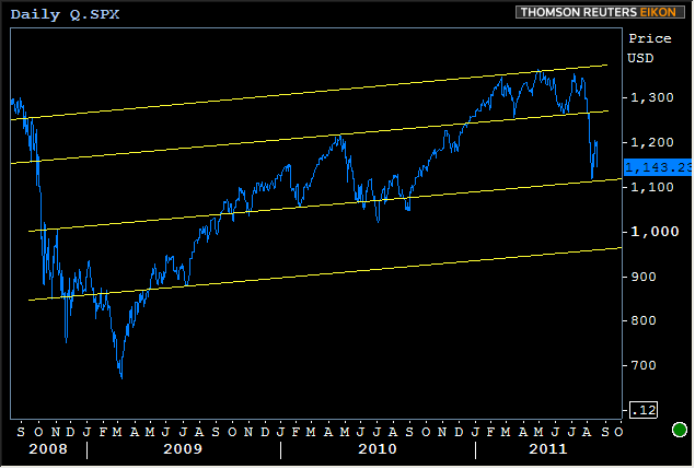
(not that late 2009 and all of 2010 were almost exlusively supported by the 2nd line from the bottom--the same line that stocks just hit. Note that 2011 was, until recently, a great time for stocks. How interesting that trendlines of the same slope line up those "good times" EXACTLY with the last major low before the crash in 2008, as well as the "dividing line" between the awful ranges of late 08/early 09 and "everything else." The fact that stocks bounced perfectly before entering the lower awful zone is telling you something: If we break into those lower ranges, a dip near 1000 could come very quickly.)


