After Wednesday's Fed-inspired rout, bond yields have done a great job finding support in the 1.56-1.59% area overnight amid high volume trading. All other things being equal, and purely from a technical standpoint, this speaks to a good case for resilience.
The 1.56-1.59 area has generally held up as the lower end of 2021's "intermission" range. Yields have moved below that on occasion, but not for long--not until last week anyway. By treating that same area as a sort of ceiling in the overnight session, bonds are telling us there's a chance that it will evolve into a friendly inflection point that offers support in the near term.

"Near term" is a cop-out used by analysts and economists when they don't want to commit to too specific a time frame. I could say "in the coming hours" to be safe, but there's also a chance that yields aren't inclined to move back into the 1.6's for a month or two. By saying "near term," economists/analysts are less susceptible to attack from their relentless critics (even if they're more susceptible to eye rolling from those hoping for more specificity).
As is always the case with this game, if people want a more specific outlook for the future, they're going to have to deal with far greater variability of outcomes. This applies perfectly to the Fed's dot plot, and traders would do well to remember that the dots are just a bunch of guesses from people that don't have any better a track record than anyone else when it comes to predicting the future. Case in point, in June 2018, the dot plot put the median Fed Funds Rate at 3.125% by the end of 2019 and 3.375% by the end of 2020. But it stalled out at 2.375% and never went any higher. Now it's been at 0.125% for more than a year during a time where the Fed figured it would level off around 3.0%.
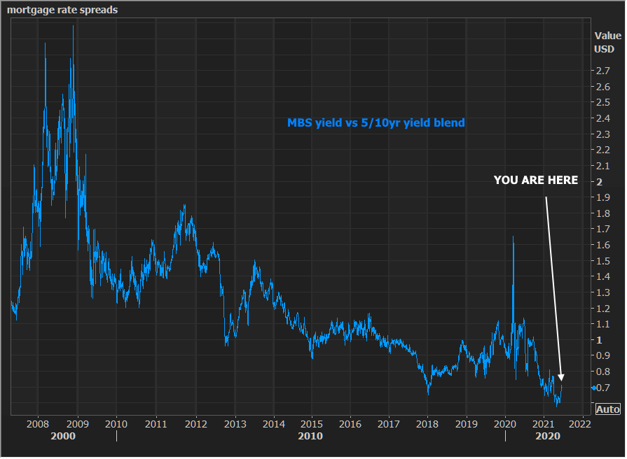
Sidenote: We discussed MBS spreads vs Treasuries briefly in MBS Live chat this morning, and I snapped the following chart. I know some of you are interested in seeing how these things evolve over time, so here you go. For those who are wondering what they're looking at, the blue line essentially charts the performance of MBS versus Treasury benchmarks (a blend of 5 and 10yr yields in this case). The lower it is, the more MBS are outperforming.