Last week brought a bit of a bumpy ride for bond markets with trade-related news accounting for most of the drama. Things were more uneventful on the first 3 days of the week, but Thursday and Friday saw yields threaten to resume the sort of uptrend seen at the beginning of September.
With the overall rally trend closing in on its first birthday and with the total drop in 10yr yields being roughly 175bps as of last Monday (3.26% in late 2018 to 1.51%), every time selling pressure picks up in a noticeable way for more than a day, it forces us to consider the mortality of that long-term trend. In other words, is this the beginning of the end of 2019's rally? Are last week's rates the lowest we'll see in a long time?
I think the market is going to do a pretty good job of letting data and events be its guide in that regard. If econ data shows some resilience and if a trade deal quickly materializes, we could indeed see upward pressure on rates consistent with 2019's good times being over.
But we're not seeing that stuff--at least not yet, and certainly not in any overly-compelling way. Just a few days after last week's trade talks ended, the most upbeat takeaway was called into question as Chinese officials were cited as saying they'd need another round of talks before signing even the phase 1 deal. This led to a reversal in some of Friday's bond selling and it highlighted an important development seen time and again in the world of bond market analysis.
As yields rose, both professional and armchair analysts were quick to point out various technical mileposts. Moving averages (MA) are probably the most common among those, with the implication often being that MAs offer some sort of supportive ceiling for rising rates that, if broken, suggest more rapid selling pressure ahead. Conversely, moving averages underfoot suggest resistance to further gains and a breaking through those floors suggests more momentum in a friendly direction.
But all of that is questionable at best, and fairly stupid/dangerous at worst. Let's look at a few examples from over the past 5 years. Before doing so, I'd like to point out just how arbitrary MA levels can be. Lots of people use 25, 50, and 100 day MAs simply because these are the sorts of big round numbers that they're used to. This is why we offer these levels on MBS Live even though they're not my favorite. For instance, 50 trading days is a meaningless interval in markets. 66 days would be much better as that's about how many business days we typically see in 3 months (aka 1 quarter of trading). In the first chart, note that the bounces are much closer to the 66 day MA versus the 50 day.

With that in mind, we'll use the 66 day MA for the following charts, even though the thesis will be "don't pay attention to MAs."
2013 offered a good example of being skeptical when a break below a moving average suggests a sell-off is over. Rates ended up rising back to even higher long-term highs shortly after the friendly signal. Then in 2014, a break above the moving average provided what looked like a clearly lock signal--evidence that the 2014 rally was at risk of ending. That lasted a few days before the rally resumed and took rates significantly lower.

The examples of misdirection were in heavy supply in 2016-2018. Once again, breaks above the moving average in early 2016 suggested the rally was running out of steam right before rates went on to make new all-time lows. The late 2016 breakout was one of the few times the MA breakout was worth a damn, but even then, that was only because the presidential election happened to support it. 2017 and 2018 both offered solid examples of misdirection as MAs prematurely suggested the end of 2017s rally and the end of 2018's sell-off.

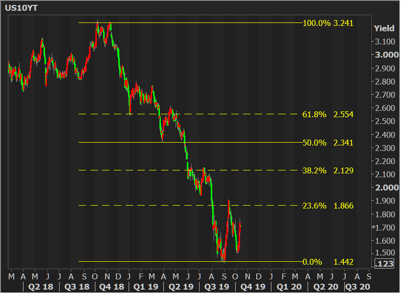
If moving averages are so terrible, what else can we use to accurately predict the future? The only responsible answer is "nothing," but here's another tool analysts incorporate fairly regularly: fibonacci retracement levels. The problem with these is that can be set fairly arbitrarily and that there's no hard and fast rule governing their analytical usage. Some say that when yields move more than half-way to the next rung on the ladder, they're more likely to follow-through and hit that rung before returning to the previous one. Others treat the rungs as actual pivot points. In that sense, the break below 2.129 in mid 2019 was a pretty solid example of yields returning to a pivot point to use it as a ceiling, but a really lousy example of the classic fibonacci retracement methodology in that yields were more than halfway to 1.866, but they instead bounced back up to 2.129.
On an anticlimactic note, over the years, we see much better results come from simply choosing our own pivot points and trendlines based on recent trading behavior as well as high volume bounces from the past. For instance, 1.75-1.76 was a pivot point we identified as one of the nastier upper boundaries of a potential sell-off in the event that the early October bounce was confirmed. We also had 1.59% on the list, and 1.67% as the one of the most frequent scenes of bounces in recent months. Those ended up being the only 2 pivot points that saw multiple bounces. Moreover, when they were broken, yields moved quickly to the next pivot point.

Does that mean I predicted the future? I wish! It simply means that recent precedent allowed us to identify important lines in the sand. Predicting the future would require me to say we'd bounce at a certain level and not break above it. There's no crystal ball involved in saying x.xx is an important level that could result in more brisk selling if broken.
With all of the above in mind, this week is starting out with 1.67% again playing its pivot point role. Yields rallied in the overnight session and have now bounced on it as a floor. That leaves us with a bit of a showdown between 1.755 and 1.67. We'll get a suggestion about near-term momentum when we see which one breaks first.


