For the third day in a row, MBS prices pushed into new lows for the year and 10yr Treasuries came as close to testing 2.40 as they have since last October. At 101-20 to 102-03, today's trading range for Fannie 3.5's is as narrow as it's been in days, speaking to the "new normal" in terms of volatility. 10yr yields similarly held a slightly narrower range from 2.33 to 2.40 (2.399 to be specific).
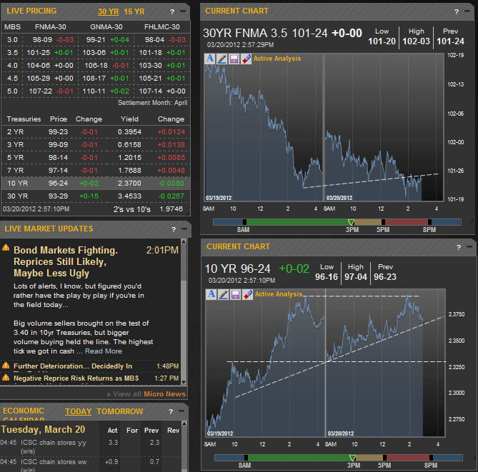
(source: MBS Live)
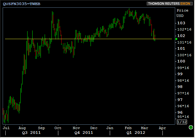
Despite moving slightly lower on the day, at current levels, MBS are set to go out the door somewhere between 101-23 and 101-26 barring any gyrations later in the day. Any way you slice it (and especially if you're looking at 3pm vs 5pm as a closing time), it's interesting to note where we sit in the context of the entire rally since the August FOMC. If the line on the chart of Fannie 3.5's below looks familiar (and assuming you've been reading the commentary here over the past 6 months), a quick perusal of some past articles should bring the memories rushing back: Return of the Concrete Ceiling/Floor?
But the ultimate fate of the so-called "concrete floor" (previously "ceiling") has less to do with MBS themselves and more to do with the broader ebbs and flows in bond markets. As the ubiquitous proxy for the "bond market," the technical considerations for 10yr Treasury yields are as good a place as any to measure those ebbs and flows. We're specifically interested in 2.40 to 2.42 at the moment--the former due to it being easier to say and a nicer round number than the latter which is the actual high from 10/28/11.
The "broader range" has always been about 2.40 since then and we've stayed so far away from it that it has been a very bumpy and abrupt ride on the way back up. Our first clue that something is different this time, apart from the fact that you can't stick your head out the door (my door anyway) without hearing someone talking about 2.40, is that we've spent more time here, trading closer to high end of the range, whereas October was a pop and a drop.
Now, I have to warn you, the following chart might not be easy-viewing for all. But all we're really looking at are two sets of trendlines, bullish (red) and bearish (teal). Each set is parallel to it's teammates and each trendline has seen a much higher than random incidence of acting as a supportive ceiling or resistant floor. I'm sure we'll discuss this chart in greater detail in the future, but for now, I just wanted to put it out there for your perusal with a few brief thoughts.
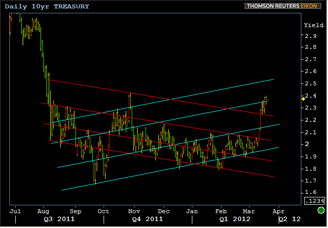
If we think about any market movement, we're constantly in a state of "trending." In other words, we're always moving up, down, or sideways in SOME context. In looking at the various highs and lows over the past 7 months, it looks like there's been a linear downtrend (red lines) that has been almost exclusively contained by the lower three lines in the chart. But at times, you've also heard us mention the "counterattack" trend, especially recently. It's possible or even likely that the yield movements yet to come will generally continue to favor highs and lows that touch these various trendlines.
That doesn't really do anything to predict what's going to happen tomorrow and the next day, but it can help us identify what sort of TREND the market is engaged in. I think it's safe to say it was a downtrend that was officially broken in mid March, and has moved up in yield to test the second most aggressive internal trendline from the opposing uptrend. In this way, yields could easily leak higher than 2.40 without any major implication of the end of the world. As you can see, yields could in fact be closer to 2.6 without the current move really falling outside the broader trend. I don't really think that's going to happen tomorrow, or soon. The point is that if we identify the trends, we can be somewhat better prepared for what might lie ahead when they're definitively shifting.


