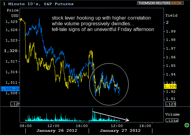
The trading day is rapidly growing uneventful and charts suggest that quite a few market participants already have one or more feet out the door for the weekend. The only real pop of volume and volatility was seen around this morning's GDP report, which was generally a mild boon to bond markets. Consumer Sentiment was close enough to consensus as to have been a non-event and everything since then has been even less so. Trading ranges are narrowing...
Stocks and Bonds are following each other to a greater extent... and Volumes are rapidly dwindling... Unless something unexpected happens to cause a surge in volume and volatility, game over... bond markets win.

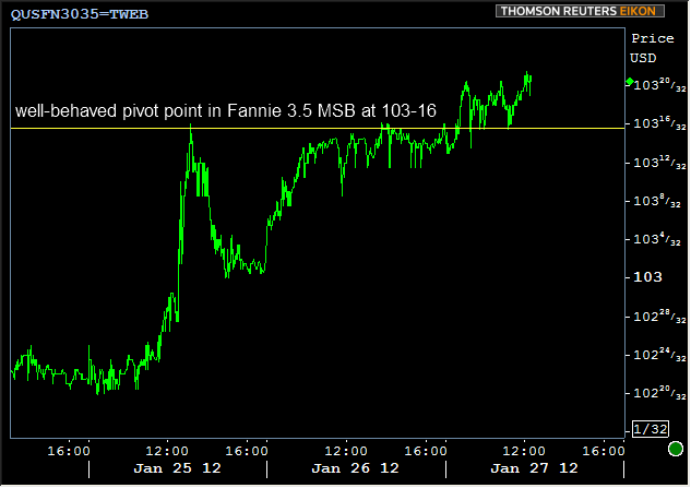
Not only is the pivot point seen in the video a ceiling from yesterday, but it was a major ceiling from the day before, after the FOMC announcement. This simply reinforces its role as a supportive ledge of some significance. Of course that doesn't suggest it's more like to hold than not, but is useful to us in hindsight as a break below it would let us know that trends are shifting.

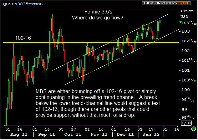
Although this pivot-point is supportive and informative in the short term, the long-run fate of 3.5's is less cut and dry. Production MBS will soon reach their all-time highs (if they continue in the current trend channel). There's no rule that says they can't go higher than this, but we'd remain vigilant if not defensive against the fact that they're not only at the top of their trend channel, but also near those all-time highs.

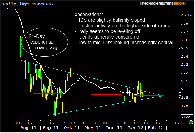
While it's true MBS have done an admirable job of marching to the beat of their own drummer (FYI, that drummer's name is "the Fed" and/or expectation of ongoing future Fed support), spreads cannot tighten iAtndefinitely and the trends in underlying Treasury benchmarks, among other things, will help shape the playing field for MBS. With that in mind, we continue to see consolidation in the range of yields in 10yr notes. In the initial leg of the rally, yields were bouncing back and forth around the 21-day moving average in large chunks (infrequently crossing), but into the end of the 2011 and the beginning of 2012, yields have stayed closer and crossed more frequently. It's as if a firmly plucked guitar string is slowly returning to rest at its point of equilibrium. This one looks like it's the low to mid 1.9's.

The message here is that benchmarks are essentially looking "stuck" until something bumps them out of this narrowing range. I'm not personally a huge proponent of moving-averages as predictive indicators, but with respect to the chart above, if the moving average were to break beyond one of the trendlines, "something new" is likely to be confirmed as happening.


