The ADP Employment figures that come out each month, 2 days before The Employment Situation Report (1 day before this month due to the shortened week) are the subject of much debate. Many-a-soapbox speech has been made by TV's talking heads and laypersons alike, so depending on who you hear (and how loudly they're speaking), you might think that ADP is a horrible early indication of where NFP will print. Conversely, you might also think that there are few, if any, more highly correlated pieces of employment data. Either way, you're right.
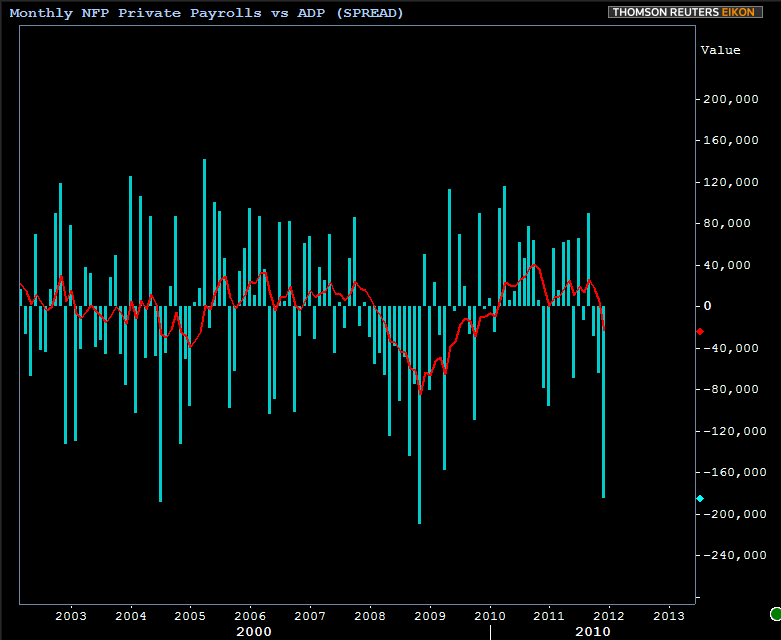
If you want to make an argument that they are not correlated, you could easily point to the fact that they almost always differ, and sometimes the gap between the two is rather large. Additionally, the gap tends to favor each report alternately, rarely seeing several consecutive months with the ADP reporting higher than NFP or vice versa. To illustrate this point, here's a histogram of the SPREAD between the two (essentially NFP minus ADP). As you can see, it would be uncommon to see a third consecutive month with NFP minus ADP being a negative number, but this did happen frequently in 2008.
If, on the other hand, you'd prefer to think of the two as correlated, simply overlay the two on a chart:
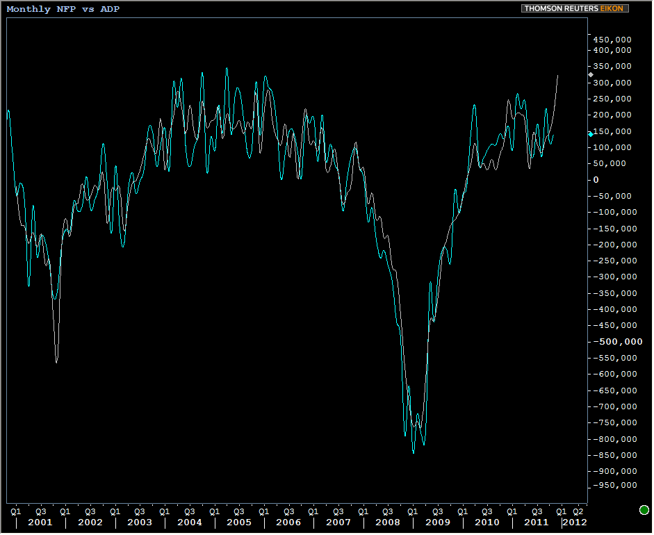
The fact of the matter is that they're insanely correlated over time, but it's the margin of error that bothers skeptics and naysayers (a group I more closely identify with). But the above chart is a request, of sorts, to my fellow ADP naysayers to be tolerant of the buzz and market-based reaction often garned by this report. Over time, the two can't help but be correlated because they're essentially measuring the same thing (speaking about the private payroll component of NFP by the way, not the headline--another source of confusion by the way).
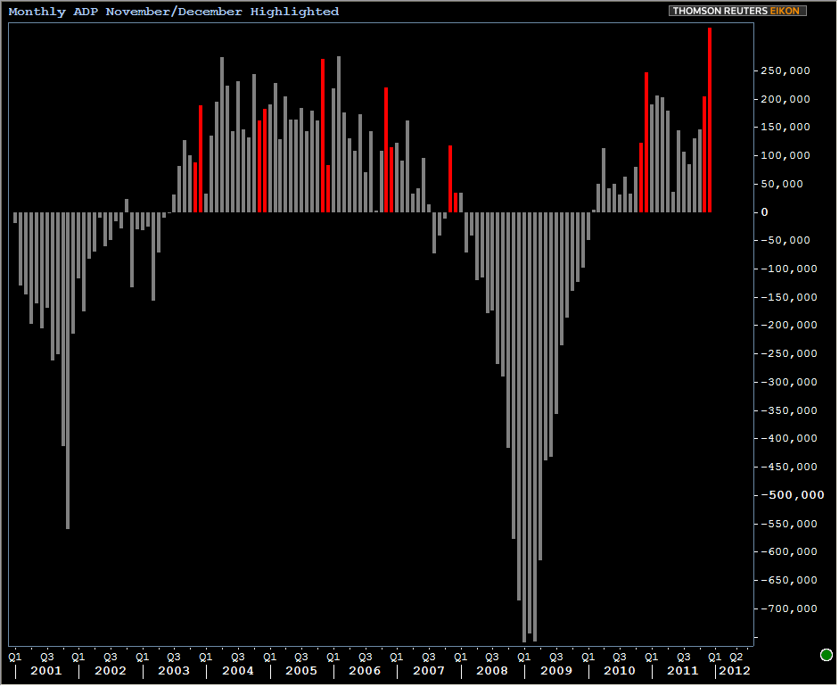
Whether or not the two end up being close to each other this month remains to be seen (obviously). Here's a chart of ADP only, with November and December highlighted. ADP does tend to capture more seasonal variation in the winter months, very noticeably in 2010 when NFP did not follow suit at all.
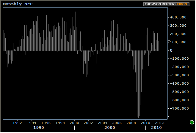
Finally, here's a chart of NFP all on its own, simply to stare at for those who are interested in such things.
The market reaction to this morning's ADP numbers was immediately apparent, but soon subsided. 10yr yields are roughly in line with yesterday's afternoon levels and although you can't quite see it on the chart below, stocks seem to simply be reaching for Tuesday's highs (and coming up a bit short)
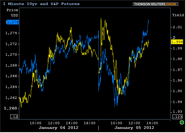
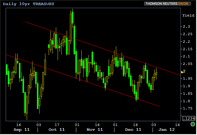
The broader theme of the trend channel remains in play for 10yr yields. One would assume that an upside surprise on NFP--even with the lingering specter of Europe's dominant role as a domestic market mover--would force a breakout of this trend and a test of something around 2.10 for starters, while a "miss" would likely produce more aimless meandering within the railroad tracks.
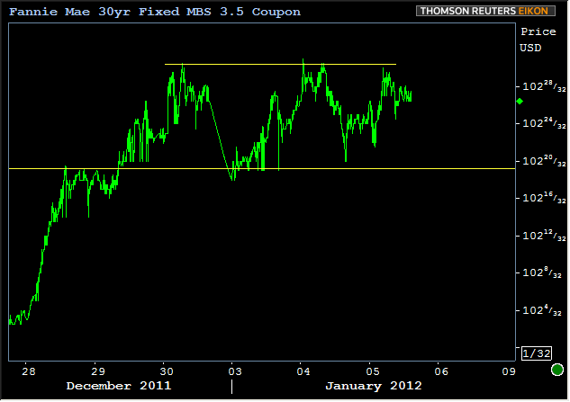
Here's a security that doesn't seem to mind the contained meanderings of benchmarks! Fannie 3.5's! They've simply been crushing Treasuries, continuing to trade in a tight range capped by 3 month+ highs just under 103. Keep in mind though, that the charts will soon take a 10/32nds (give or take) dent due to the roll to February coupons (next week).