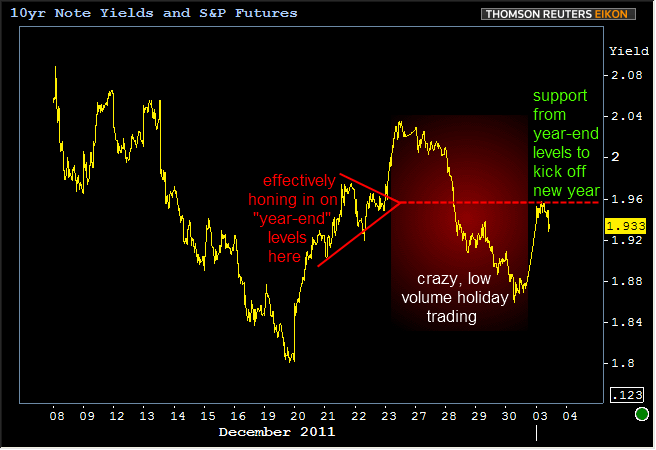
As expected, volume has been significantly better than in recent holiday weeks, although still nowhere near early December norms. MBS and Treasuries have been doing an admirable job of holding their ground. Why would we call a 5bps weaker 10yr Treasury Yield "admirable?" Basically because the past few weeks of trading--for lack of a truly ideal way to say this--didn't really exist. Between the absenteeism, year-end/month-end/quarter-end tradeflow and portfolio positioning needs, the distinct lack of meaningful Euro-drama, and of course the outright low volume itself, the trading that occurred after 12/23/11 was never in much of a position to stand as an indication for where the markets truly "wanted to be" once those various complications were removed. In this manner of thinking, Treasuries and MBS really arent' "weaker" per se, but rather, confirming some of their previous gains. This can be seen in the next two charts:
Due to favorable supply/demand technicals in MBS (would you believe "more buyers than sellers?), Fannie 3.5's are even holding up versus later December bullishness.
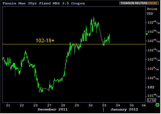
Do keep in mind though, that relative to early December norms, MBS were slightly more active than Treasuries in the last week of December. The relative strength of MBS continues to play out today as Fannie 3.5's have been doing more testing of bullish trends (upwardly sloped) versus Treasuries testing to break a pivot point (horizontal line / neutrally sloped)
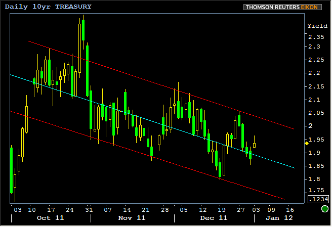
The broader and more restrained view of bond markets is that they simply remain in long term trend channels, with the following 10yr chart being a great example:
Now for the counterpoint of the day regarding this morning's economic data. As was noted in the Construction Spending post earlier:
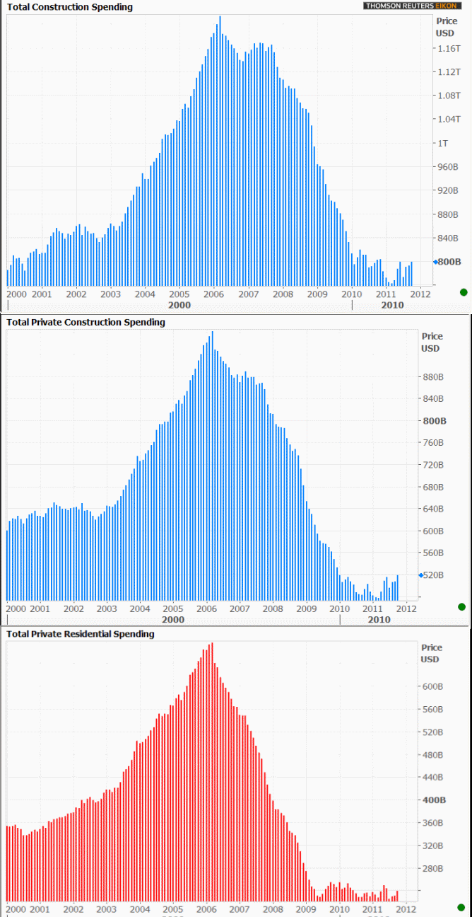
Counterpoint: Being able to say "highest/best levels since June 2010 for the headline or Dec 2009 for private spending" is all well and good, but such statements grossly misrepresent reality. Consider the Private Residential Spending component as an example. It rose from $517.3bln to $522.3 bln. That seems fine, and is indeed it's best level since Dec 2009 (sounds impressive, right?), which is certainly a better thing than an ongoing slide lower, but as you'll see later today in a chart posted to MBS Commentary, this is effectively still a skid along the bottom--just barely considering a break out of an extended stay in a range of the lowest levels since the late 90's. In March 2006, this same figure was nearly $1 Trillion. It would need to move over $650 bln in order to break a plateau from 2001-2002.
And now for those charts, as promised. If nothing else, the takewaway should be that the "headline" number (total construction spending), looks a lot better vs historical levels than the components of the report. When we examine the component that's most relevant to housing: private residential spending, things don't look quite so hot (in case you thought they looked or sounded hot in the first place).