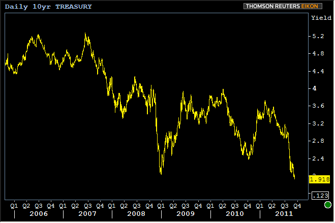
Just a few long term charts here to see you off into the weekend. It's always fun to look at the long term charts on record setting days, right? I keep hearing something about lower 10yr yields at some point in ancient history, so while this might not be an actualy "record low yield," it might as well be, at least as far as modern economic history is concerned:
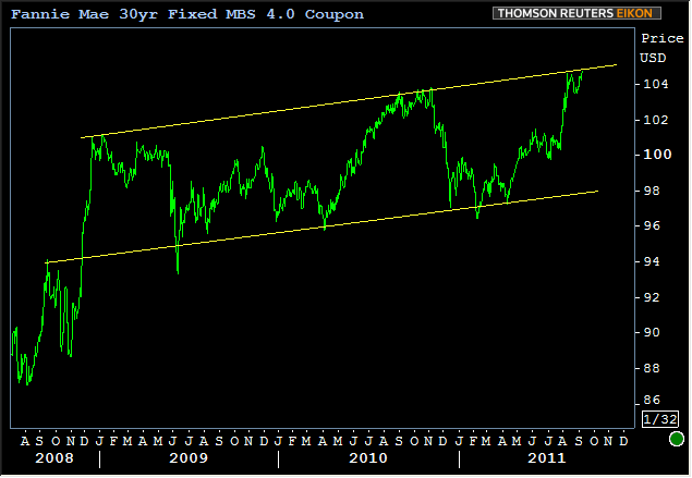
Yes, according to 10yr yields, things are worse than 2008. But how about the star of our show: MBS? Since 3.5's weren't even around back then, we'll keep the long term chart to 4.0's, looks like an uptrend, right?
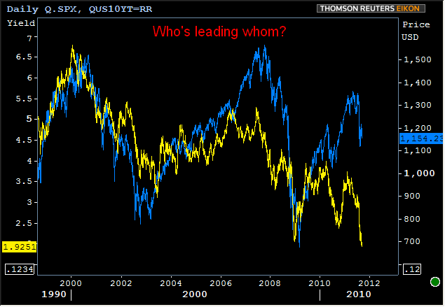
The uptrend is highlighted more because it's amazing than it's predictive. That said, if we go back even further and take a look a 10yr yields and stocks, it does look like the uber-long-term trend in 10's has been down down down. (it also looks like stocks are gonna need to call a bluff pretty soon, or fold).