Stocks, Bonds, MBS, all correlate by varying amounts. As the level of uncertainty has drastically increased in markets, we've seen a lot more connectivity between stock prices and bond yields. Beyond that, we almost always see a high level of correlation between bond PRICES and MBS PRICES. The following charts show how some of those correlations have been playing out recently. The theme is that things tend to move in the same direction for Treasuries and MBS. Fixed income YIELDS tend to move in the same direction as stocks. Case in point, look at the past few days of S&P Futures vs 10yr Yields.
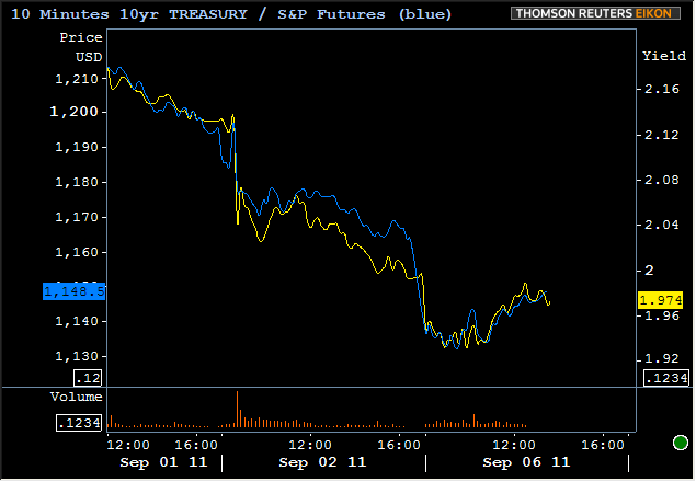
As you can see, not a perfectly linear relationship, but almost always moving up and down at the same time. This is what we're talking about when we refer to "the stock lever." Here's an even closer look at how it has been playing out so far today:
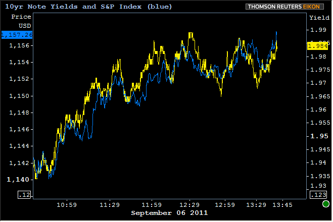
Once again, not always moving in lock-step with each other, but the overall correlation is clear.
Also clear to the point of being a given is that MBS prices are almost always moving in the same direction as Treasury prices. Indeed, this is one of the reasons we often discuss 10yr yields with respect to MBS (more importantly, they're a better guage of the overall bond market sentiment). We've used the analogy in the past of "dog and master" walking down the street. The master sets the pace and direction of the walk, but the dog can either tug at the leash or lag behind. It's similar for MBS and TSYs. Treasuries are generally going to go where they're going to go and MBS may go faster or slower, but almost always in the same direction. The farther away MBS move relative to Treasuries, the tighter the metaphorical "leash" gets, and MBS begin to look either overvalued or like a bargain buy.
We definitely saw some interesting action with respect to Treasuries VS MBS today. Earlier in the day, when panic and uncertainty were more of a factor, Treasuries were outperforming. Then as 10yr yields stabilized and headed back toward 2.0%, MBS, rather than weaken in proportion to TSYs, merely held sort of steady. The following chart uses Treasury futures in order to show PRICE vs PRICE.
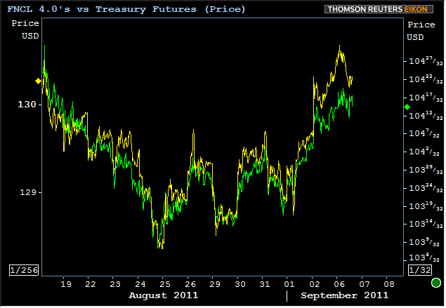
Above, you can clearly see the yellow line gap out to the upside into the first part of September and then into this afternoon, you can see MBS just hold relatively steady as TSY prices came back down. Any time TSY yields are rising or "risk-tolerance" is generally increasing, you're more likely to see MBS do this--hold their ground to against losses to a greater extent than Treasuries. The long-term underlying phenomenon that makes this more likely these days is the overall "wideness" of spreads. That means that Treasury yields are lower and lower versus MBS yields (MBS yields are something we don't talk about frequently because of the subjectivity and complexity inherent in their calculations). Speaking of that subjectivity, we'll caveat the chart below to say that it expresses a line chart of MBS yields minus Treasury Yields (4.0 vs 10yr) and that those 4.0 yields are subjectively calculated based on Reuters prepayment speed assumptions. As such, the actual spread levels may vary from other calculations, but any comparison of MBS to TSY yield over time should generally paint a similar picture. The picture? See for yourself... Spreads are as wide as they've been since the Fed first started buying MBS in early 2009.
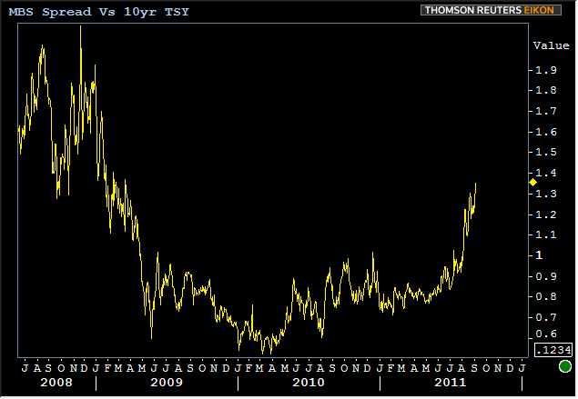
Uncertain fate of GSE's? Risk out of fashion? A number of things are and could be contributing to the wideness of spreads here, but ultimately, market metrics are saying that MBS are currently perceived as being about as risky as they were at their best levels of 2008. Given the changes in underwriting and lenders' more stringent application of guidelines since then, would you agree this should be the case?


