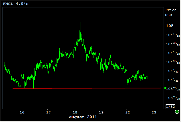
Today has been exceedingly boring and sideways for MBS and Treasuries alike. But to an even greater extent than their benchmark big brothers, MBS have recently shown a propensity to return to the same small range of levels, just over 104-00 in Fannie 4.0s and in the low 101's for Fannie 3.5s. The chart below shows how 4.0's have been moving in pockets of sideways action and the following chart will illustrate how that fits in to a larger sideways trend.
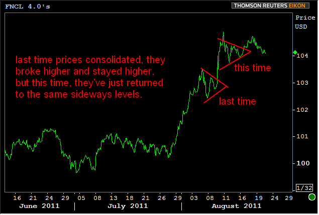
Here's a chart of a longer time frame showing how the current sideways movement marks a regression to a recent point of consolidation as opposed to the previous instance of consolidation which resulted in higher prices:
The reason 4.0's are able to get so sideways right now is at least twofold. There are other things to consider beyond these two factors, but for the most part, here's why you're seeing this:
1. As MBS have rallied, 3.5's are in a better position to capitalize on the rally because their longer duration better matches the preference for longer durations seen in the Treasury yield curve. Uper coupons "compress" and get closer together at a faster pace. Movement is more readily seen in the lower coupons and 4.0's join the rest of the MBS stack in looking "more sideways." In essence, 4.0's are showing the first signs of being "past their prime." When rates are this low, 3.5's are simply going to be the most sensitive to changes in the yield curve and thus exhibit the most directional movement.
2. Compounding the "sideways" vibes is the fact that even benchmark rates are doing some sideways sliding of their own. Either that, or we are straight up witnessing the early signs of a counterattack against the recent bond market rally.
Why counterattack? Because the trends that brought 10yr yields to the low 2's were blatantly obvious and blatantly directional. As yields approached the low 2's, trends began to emerge suggesting a "leveling" off might be seen. And now, after the brief foray into the 1's, two things are striking. First, yields never closed lower than 2008's closing low at 2.06, and the various lows and highs seen through the day have generally fallen on a gradually sloped trendline leading back higher in yield.
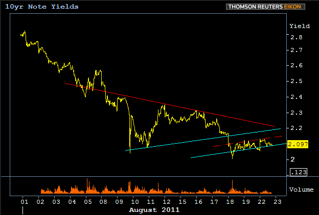
The solid red line show the first major shift away from the directional mad-dash to 2%. The teal lines show the recent trend higher in yield. Granted, volume is rather low now compared to the intial dip below 2.10, but considering the issue of the daily closing low at 2.06 as well as the recent technical behavior, we can at least say we have some trends to watch as far as confirming or rejecting the existence of any rebound momentum. Surely, we'll revisit that solid red line, the breaking of which would be another indication of a turn-around. For now, the most important line in the chart above is the one that's not pictured, largely because its placement is open to interpretation. It's the line that's moving SIDEWAYS along these all-time lows. Cases can be made that it's at 2.06+, 2.10, 2.13, 2.17, or 2.20. Really, all these levels are valid, and choosing one doesn't matter as much as simply ascertaining whether or not the movement is predominantly sideways or whether this "counterattack" has legs. By the time this Friday's Bernanke fireside chat from Jackson Hole rolls around, we should know a lot more about that.


