The bond market has been building toward today for some time-weeks, maybe months.
The most recent stage of the MBS rally has been in motion since April 11th when underlying benchmarks were able to hold onto ultra long-term support that stretched back to a bullish trend which began BEFORE the financial crisis even unfolded. With the two exceptions of the initial crash itself in 2008 and its encore performance into the fall of 2010, this trend has contained ALL of the movement in the 10yr yield. It looks like this:
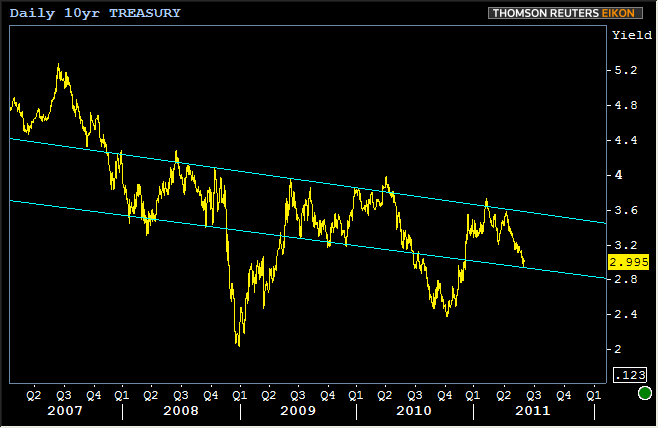
We'll be focusing exclusively on the 10yr Treasury note tonight due to its ideal role as a benchmark of the general "bond market." While it's true that loan pricing is derived from MBS, our goal tonight is to examine long-term, big-picture movements. After all, we know where we've been. These 10yr charts are better places to look if we want to understand more about where we might be going.
Now! That sounds dangerous! Predicting the future? That's not exactly the best idea at this particular point in economic history. But even though we're not willing or perhaps even able to feed you the answers to questions about what the future holds, we can certainly provide you with some food for thought. Seeing as how we've made so much of "history repeating itself" recently, tonight's menu offering is for those who hunger for the ongoing bullish perspective.
MUST READ: Bond Market Repeating History. False Start Fuels Rally
Could things happen in the same way that our view of "repeating history" suggests? It's certainly possible, but we want to warn you up front that this is only one of the possibilities and history obviously can't repeat itself forever. That said, it has done a fairly good job so far!
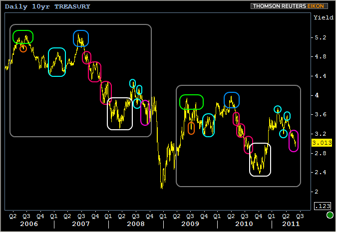
The chart above shows 10yr yields from 2006 to present. The two squares indicate the two stretches of time in which history can be thought of as repeating itself in terms of how yields are moving. Take a moment to match up the various color-coded peaks and valleys between the two sections. Here's a play by play from left to right:
- A massive "double top" is seen over the course of two years with similar dips early in the cycle (orange), similar false bounces in the middle (teal) and the 2nd of the two tops in the blue square
- From there, 3 consecutive red areas highlight the various stages of consolidation and confirmation experienced by yields as they fall rapidly.
- Then, in the lowest section (white), the long term bounce takes almost exactly the same shape. Uncanny similarities here!
- The three small teal sections that follow show how in each case, the most prominent peaks and valleys that followed the white section were strikingly similar in proportion.
- The 2 time periods culminate in the light purple area at the far right where yields move decisively lower once they break past the previous low in the adjacent teal circle.
Pretty fascinating stuff, right? And while it could turn out to mean absolutely nothing about the rest of 2011, what's the implication were history to keep repeating itself? It's fair to at least entertain this eventuality with the impending conclusion of QE2, the gathering storm of progressively weaker economic data, and what many consider a central component to the ultimate recovery-the housing market-still very far from being even on its way to a healthy state. AQ has described housing as "stagnating in a pool of its own filth" actually.
Given the somewhat lower amplitude of the more recent stage (that would be the big grey square on the right, in case I've lost you), if history does indeed continue to repeat itself, then the suggestion is that we could see movement something like this...our first target is a 2.85% 10yr note yield. But first, NOTICE THE NEXT MOVE IN REPEATING HISTORY IS YIELDS MOVE HIGHER.
The intense volatility that could be just around the corner would logically coincide with the termination of QE2, and yields would once again move lower to test all time lows in the 2's. Possible? Yes.... Probable? No way to know, but we've talked enough about history repeating itself that we wanted to give you one of the frameworks for looking at and thinking about it, as well as some context as to what it might mean if it continues to happen.
For now, today's Employment situation report amounts to the best piece of confirmation so far for the validity of the 2 month rally that began in early April. Volumes have been astonishing in Treasuries this week and have finally reached levels where secondary managers have begun hedging with 4.0 MBS in greater numbers than 4.5's. That means that 4.25 Best-Execution rates are a real possibility in the near future, to whatever extent that something unforeseen doesn't reverse the present trends in the market.
This is the guidance we shared with consumers today...
From Mortgage Rates: Tear Down This Wall!
CURRENT GUIDANCE: With "The Wall" now torn down a path has been paved for mortgage rates to continue improving. An extended rally will not come without setbacks though. Short-term corrections are to be expected along the way. That means borrowers who are working on a shorter lock/float timeline should remain defensive. Your main goal is to protect new, lower rate quotes from short-term market fluctuations,which could happen as early as Monday and last all week. The overall bullish trend is very much in tact though. Intermediate to longer-term scenarios are more than justified in floating.
Have a good weekend folks.
MG&AQ


