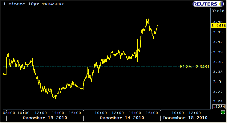
Bonds got killed, revived, and killed again numerous times today. All in all it was about a 20bp rise in YIELDS in the 10 yr which can be seen occurring from 3.27 to 3.47 in the chart below. In the coming days and weeks, we're all faced with the prospect of a difficult to resolve debate about how much of this tank in bond prices is "oversold" or "year-end," and how much of it is absolutely appropriate if one assumes that the Fed is holding true to a portion of their mandate to REINFLATE the economy.
Today, we'll take a look at long term charts that have proven reliable based on past market movements right up through today and what they say about what might lie ahead. Sadly, that prognostication is irrevocably cloudied by the uncertainty created by several things including year end and the unprecedented nature of QE2. But first, here's the damage on the short term charts. Take special note of 3.4688 in the treasury chart below. It's been my high end target for 2010 (though I had the probability of seeing it set so low it didnt' merit the discussion until today). We'll talk about why it was on our radar in a long term chart below later in this post
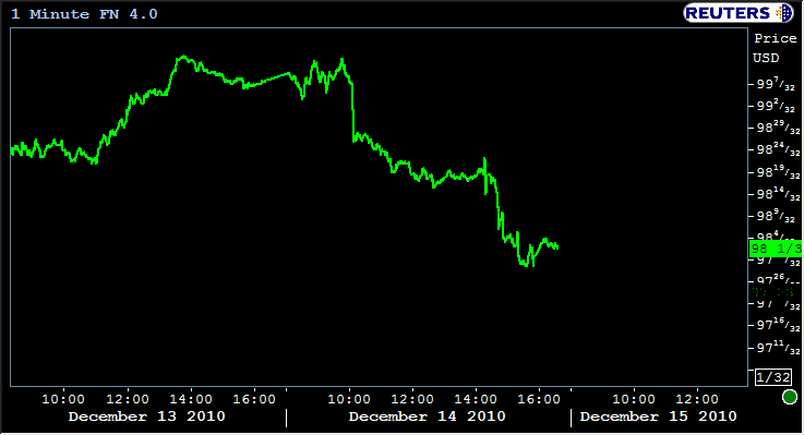
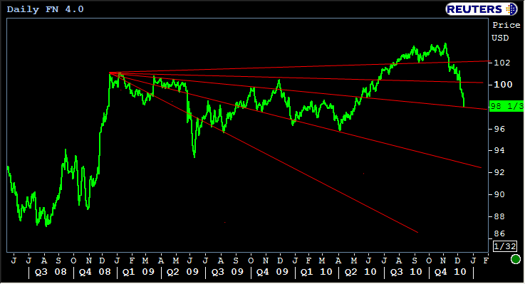
The actual shape of the short term charts above doesn't look so bad, but that's due to the chart scaling. That's well over a point of movement in day. But to really illustrate the scope of what's been occurring, we must look at the long term charts. Not for the feint of heart, the following MBS chart contains a "fan" with progressively sloped trendlines. These are all trendlines that have been pertinent over the past 2 years. You can see, depending on which moments in time you're examining, each of them gets some play providing support and resistance. As you can see, after we recently broke the #2 line, it's taken mere days to move down for the next test.
Were we to see those extreme losses, the current sell-off would easily surpase the mid-may 2009 selling that contained Black Wednesday. It's a bit more of a gentle descent overall this time, but the past few days have been rough. (silver lining: hopefully you draw some of your own conclusions about what COULD happen based on how mid 2009 shook out, and though I didn't draw it into this chart, hopefully you can see how quite a few of the lows throughout 2009 could connect to form a a supportive trend even if 4.0's fall into, say, the 97's...)
Indeed the overall territory of yield movements over two years shows a few prominent highs and a few prominent lows that lie within a parallel channel that has always pointed to slightly higher yields. In mid 2010, the slope of this channel was becoming clearly defined based on were previous points had hooked up with these lines. When October rolled around and the 10yr yield NOT ONLY put in an epic bounce off the long awaited low range line, BUT ALSO DID SO with the flair of a nearly cliche technical pattern known as a "head and shoulders" (or in this case, inverse head and shoulders), that was and still is a major sign that even if yields break back into the 2's in the future, that lower line will be HIGHLY resistant to breakthroughs.
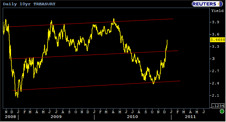
This is the very picture of a gradual increase in rates. Once can see the second, more gradual collapse of global financial confidence, and can almost pinpoint the inception of QE 2 without the benefit of an x-axis. The bottoming this fall is the fed saying "yes, we are committed to reinflating the economy." The movements in yields since then indicate that they are being taken seriously.
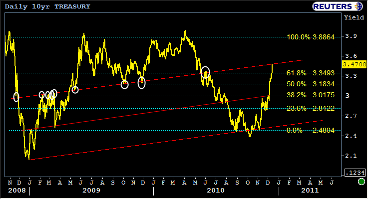
I had been looking for the center channel lines in the above chart to provide more support (there was some bounce there as we played around in the 3.2's the past few days). With that bearish breakout, it makes sense to evaluate the "next most bearish set of trends." So we nudge the slope of the line a bit and end up with a slightly more bearish trend channel that connects more highs and lows than the last. (MG, if it connects so many highs and lows why haven't we discussed it? Good question... Simply put, I didn't want to "go there" unless we had to... but indeed this next chart contains the trend-lines that I had in mind on the few occasions I had mentioned "as high as 3.47." People scoffed... and I even scoffed at myself a bit, but well.... Here we are... I put some white circles in this one to highlight the trend that has been suggesting 3.47. Not that here again, we have parallel trends showing numerous instances of support and resistance. It's not coincidence... It's the actual SHAPE of momentum with which the market trades.
I'd like to write more tonight, but let's come back to it tomorrow. Put your extremely well-thought-out and concise questions in the comments section. Believe me... I know first hand how the altitude of the little green line can unfortunately become the very barometer of many of our moods in this industry so I know today is not easy. Between now and tomorrow, just remember not to "should" yourself to death if you're like me in that habit. When it comes to MBS and locking/floating, it is your sacred purpose to become more machine than man (or woman), and though I know the emotions can threaten to break through the steely resolve on the surface, you must ask yourself if that helps or hurts you. We'll be "moving on" tomorrow with plenty of conversation about what we can do next that will amount to more helping and less hurting.


