Yesterday was brutal for rate-sheet-influential MBS. A good friend called me and apologized for doing so, saying "I bet you're getting more calls than you can handle on a day where the market moves like this."
To his surprise, I had not, and rather than view this as a result of my crass interpersonal skills, I'm more inclined to believe the reason I didn't get the amount of calls he anticipated is more due to the fact that the broader bond market saw yesterday's movement as more of a non-event. As blasphemous as it may seem to the originator in me, the analyst in me also sees it as a non-event. Or perhaps a better description would be that it is actually a meaningful event, just not a surprising one.
AQ covered a few of the technical and fundamental reasons for this already this morning (READ IT). I have a similar take on the 10yr chart, arriving at a similar support-level conclusion, using a slightly different approach. But first, here's the damage so far this AM in MBS. After dipping into the 99's, 4.0's have leveled off for the time being around 100-12.
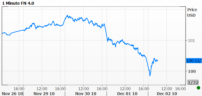
That's quite an aggressive drop. AQ mentioned negative convexity and extending hedge ratios and that's indeed the reason for what seems like an overly aggressive drop. But if the overall bond market continues to show signs that it's on the brink of a fundamental shift toward shorter durations (less sensitive MBS coupons), you tend to get a little spooked if you're in a buy and hold, much too long duration security such as 30yr 4.0's.
To illustrate this, it makes sense to look at how the 4.0 moved in the last 24 hours versus something with a shorter--and thus assumed to be a little less prone to spooking--duration such as its neighborly 4.5. The following chart shows the DIFFERENCE IN PRICE between 4's and 4.5's.
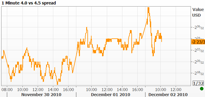
Notice that it really widens out during the more panicky minutes this morning as 4.0's sold off more aggressively than 4.5's. Bottom line there is that the longer duration 4.0's are more and more out of fashion the more the yield curve steepens/demonstrates preference for shorter duration bonds. That, I hope, goes far enough in explaining the abruptness of the morning in MBS, and thus allows us to move on to the bigger picture.
First, here's my slightly different take on AQ's killer long term 10yr chart. Note this: I don't think we can ever be certain that one technical indicator is better than another. It's less about right and wrong and more about SUPPORTING AN IDEA. So the disclaimer is that we're looking at the following chart IN ADDITION to other charts and not INSTEAD of them. Anyway... Here's a very similar bullish trend in yields, except it uses parallel trends. Nice thing is that the current implications of both AQ's and my own charts coincide at similar support levels near 3.00%
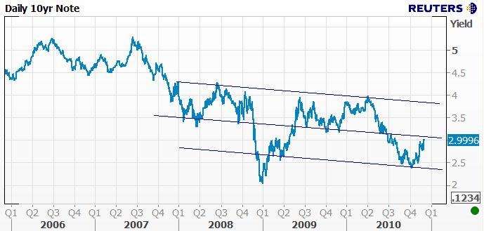
And yes, I threw out a bit of late 2008/early 09 and justified that with the modality of the line I actually used. In other words, not only was it parallel to the other lines I liked, it also connected a higher number of lows (aka "modality"). I'm also OK with lopping off extreme movements from time to time if they look like one too many standard deviations away from an otherwise stable trend. Anyway, I really like this chart as a picture of a regular range of 10yr yields that has been slightly bullish for the past 3 years. We're now on the verge of hitting that midpoint again.
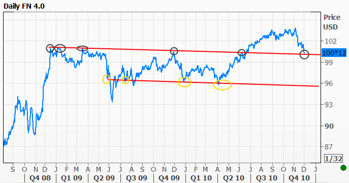
Interestingly enough, a similarly long term look at MBS also shows an "on the verge" sort of potentiality in 4.0's. But this isn't simply a derivation of the treasury chart. The treasury trend is bullish whereas the MBS trend below is bearish. It was tested several times at the outset and then again in epic fashion at the end of 09 (black circles). Since breaking in early 2010, we now find ourselves coming back down to retest the previous resistance, this time as potential support. Adding validity to the trend channel is the fact that if we look at the initial support from the sell off in 2008 and similarly factor out some of the more outlying/reactionary sell off, we find that the modal lows (yellow circles) in MBS lay parallel to the upper trendline.
These are only 2 ways of looking at the big picture, but both are suggesting that we're on the brink of "something." We don't know right now whether or not that will be BOUNCE or a BREAKOUT.
Seriously.... It could be either. Positions are much more balanced thanks to the "QEII Cleansing Process" and investors remain at the ready to move in whatever direction data and momentum dictate.
For the sake of grounding this analysis, here's a more traditional retracement chart of 10's.
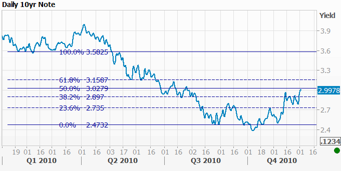
There's that 3.03 level again. And if we set the 100% line on 2010 highs, we get support around the same area except from the 38% line. So to my buddy who called... Yeah man, yesterday sucked, but I hope these charts help my explanation of why it wasn't a wildly impossible or unexpected movement to test recent ranges/technicals. NFP should be the lynch pin and I'd try my best to not get too bent out of shape about any postioning or "leading off" the market might do today. It's relative inconsequential in terms of momentum.


