This EU Summit has been the focal point of quit a bit of drama lately--perhaps too much by the time we consider the attention that the lead-up and speculation received. Not that the resulting price action hasn't been dramatic. It certainly has and it's certainly scary, but it may not be all about the EU.
We can't be sure exactly how much "market moving potential" to allocate to various fundamental and technical events. Certainly, Europe gets a large portion, maybe even the largest. But what we can be sure of is that it's a complicated and unprecedented time for markets, with added layers of complexity for the mortgage market as new HARP details are hammered out and traded upon.
This will be an ongoing discussion in the coming days and may well reach some sort of crescendo next week with FOMC Announcements, Bernanke Press Conferences and NFP Friday. For now, given that we can't be certain of how much potency to ascribe to the various players in this drama, we can at least take a step back and look at what's happening from a technical perspective.
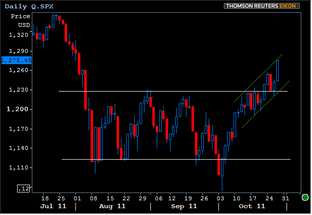
As you already know, stocks are up and bonds are weaker. Here's the scary prospect in stocks--namely, that we tested, broke, and confirmed a supportive bounce on the upper white line (and are now trending higher).
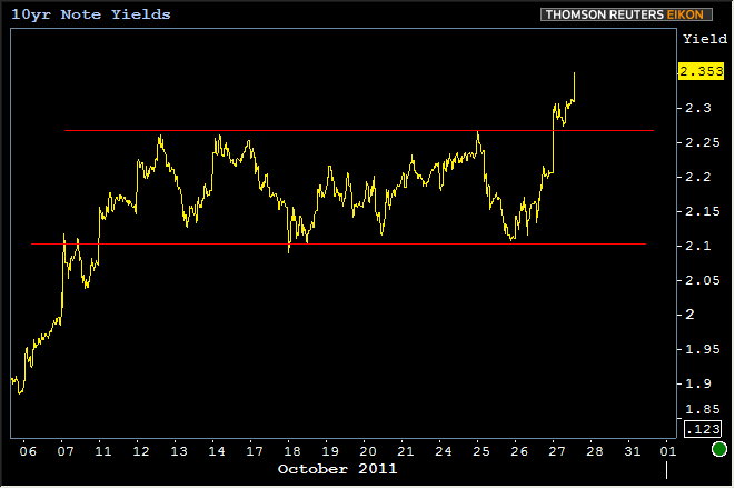
And there's an almost identical scenario playing out in 10yr yields...
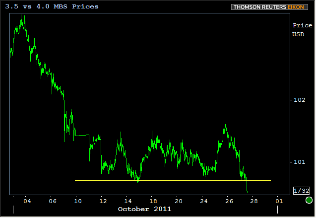
And lo and behold, almost an identical scenario in MBS.
But you probably notice the difference in time scales between the first stock chart and the TSY and MBS charts. If we look at bonds on a similar time scale to Treasuries, we don't yet see that same sort of definitive break upward. It's important to note that 2.357 came up as a Fibonaccia level in early October (using August 1st as the high range and the absolute lows of late Sept as the low. "early October" confirmed that sept low by, well... not being quite as low).
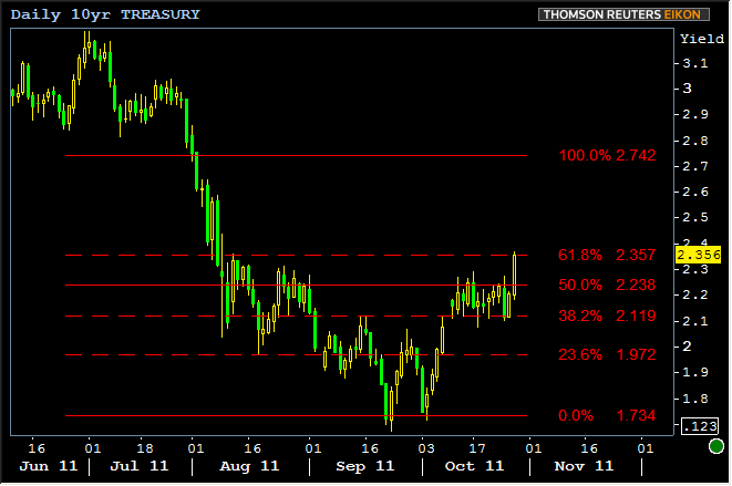
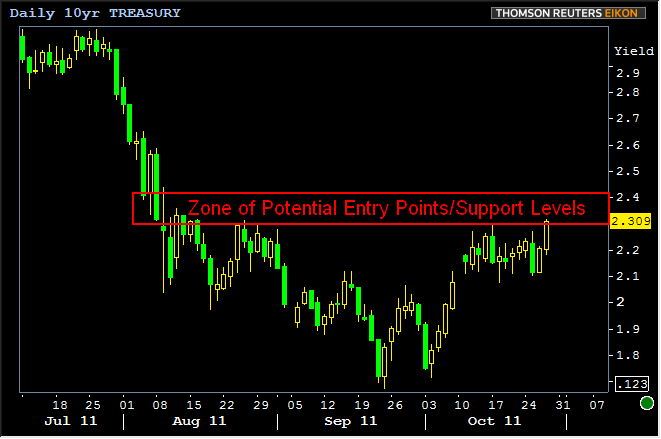
Bottom line, the technical battle we're currently seeing around 2.36 isn't some big, major, crazy, completely unexpected and ridiculously brutal market movement. It was in the deck of cards, and that's what we drew today. But please don't hear this as some sort of focus on that particular line. There are many technical approaches and we'd be remiss not to consider multiple eventualities. In fact, there's a whole band of yields that could see techical activity while 10yr yields remain under pressure, and it goes AT LEAST as high as 2.42: (note, the chart below shows pre-auction yields because I made it before the auction. If you were surprised by the violence of the move just now, let it count for something that I was about to publish a chart showing a zone of potential levels up to 2.42 even while actual yields were still down at 2.309...)
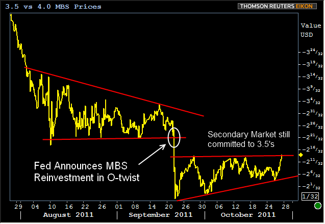
Here's some counterpoint to balance what might seem like a bearish perspective. Specific to the MBS world, there's still lots of room for both primary and secondary spreads to tighten. The price of the 3.5 coupon vs 4.0 still indicates that the Sept FOMC meeting marked a shift in the Secondary market's comfort level with 3.5s and although current weakness has that sentiment backed against a wall at the moment, it remains intact for now:
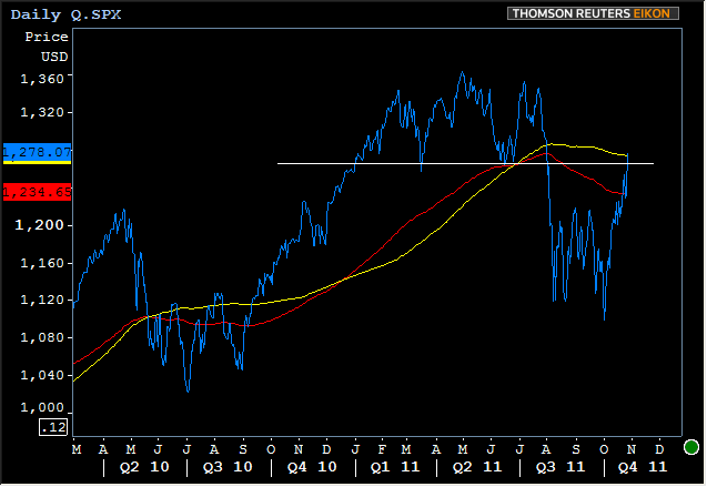
Then just for fun, (and I say just for fun because no one in their right mind would actually ever make a prediction about what stock markets might do, right?) let's take a look at the counterpoint for equities. Red line is the exponential moving average (more weighted for recent moves) and the yellow line is the simple moving average (no weighting), both the popular 200-day. Note a test and break of the red (exponential) line recently. Also a bit of a supportive bounce and promptly up to test the simple 200 day MA today. What I wanted to point out was the similar pattern in 2010. On two different occasions, prices broke the red line and yellow line only to head back lower. Point being, don't get too excited when you hear CNBC talk about a break of the 200 day moving average. A) one of them's already broken and B) the other one didn't turn out to mean anything 2 out of the last 3 times it was broken.
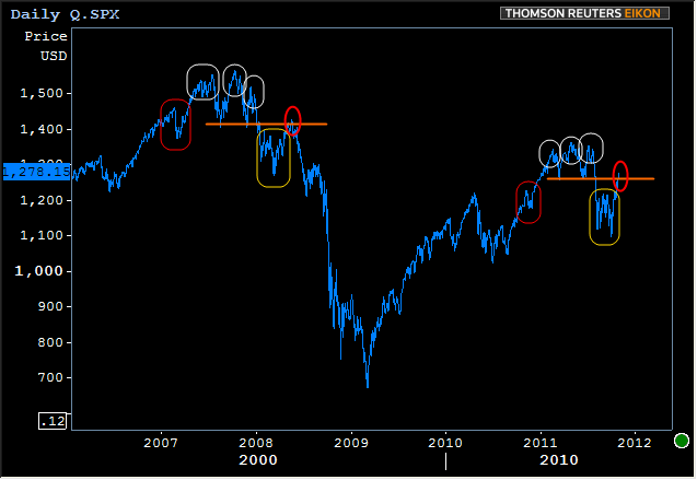
But I can appreciate that the similarities between current patterns and 2010 are perhaps not as perfect as we might like. So let's take a look at something more similar. For now, I won't comment on the next chart, but merely point out the recurrence of several themes. I'd love to get your comments on it though. What are you seeing? Also, what do you want to see in upcoming blog posts? Don't be shy to let me know in the comments section below. Otherwise you'll keep getting fringy crap like this: