How high is too high? When it comes to home prices the wounds left from the Great Recession make this question an important one. Amidst that event, home prices plummeted and didn't begin to recover until 2011. Recent price growth has been particularly strong and for a while that was welcome news. More recently though, a rapid escalation has led some to worry about the potential for another house price bubble.
Freddie Mac's current Insights report, published by its Economic & Housing Research Group headed by Chief Economist Sean Becketti, asks how one can tell it is time to worry. While there is no foolproof technique they explain a two-stage method for identifying unsustainably-high house prices.
Sometimes, the report says, it is easy to see where home prices are escalating too quickly. It happened recently with the oil price boom that generated big home price gains in some oil patch areas. The recent collapse in energy prices suggests those increases are likely to be reversed and some signs of distress are already surfacing. "For cases like these - that is, situations with geographically-specific economic shocks-no model is needed to identify heightened house price risk." But what Freddie Mac's economists are looking for is a way to spot situations where prices appear to be feeding on themselves without apparent economic reasons. This constitutes the beginning of a bubble.
One challenge is the sheer number of local housing markets - 374 metropolitan statistical areas (MSAs) and lots of important sub-markets. What is needed is a simple, intuitive metric to "thin the herd" to a manageable list of spots that merit more detailed scrutiny. Economists currently use several including affordability metrics (the maximum price an average family can pay under current rules and interest rates), mortgage-payment-to-rent comparisons, and median house prices compared to median income. None of these are without their drawbacks but Freddie Mac says the last, the house price-to-income (PTI) ratio appears to be the clearest indicator of the long-run sustainability of house prices. They used it to trim housing markets down to a manageable watch list.
Median sales prices peaked at 4.8 times median household income (PTI ratio) in 2005 then plummeted to 3.2 in 2011. Since then, the ratio has recovered and currently stands at 4.0. The lower of the two reference lines in Exhibit 2 is at 3.5. Freddie Mac says many analysts regard this as the normal ratio for the U.S.
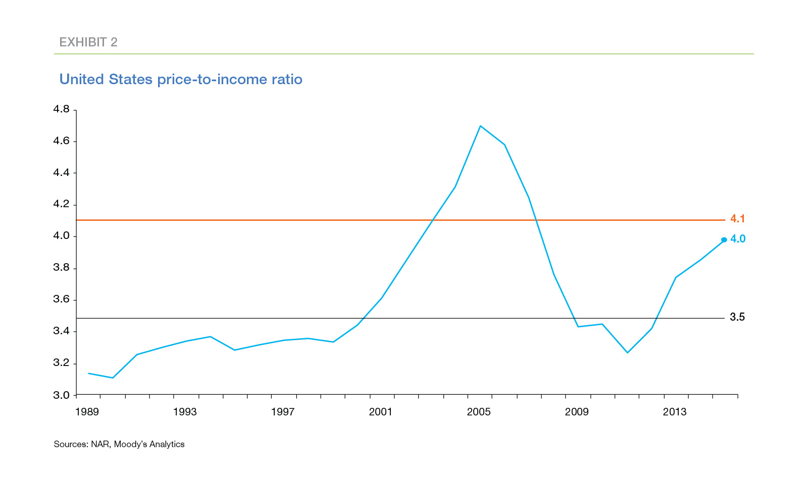
The upper line, drawn at 4.1, separates "usual" from "unusual" PTI ratios based on both the level and volatility of the ratio from 1993 to 2003. This threshold clearly highlights the unsustainably-high house prices recorded around the peak of the house price bubble. Today's national PTI ratio is not yet an outlier but it is above its long-term median value of 3.5, has been trending up since 2011; and it currently lies just below the 4.1 threshold.
While an unusually high PTI is a useful way of spotting markets worth watching it doesn't necessarily indicate prices that are unsustainable and due to fall. A house price bubble is essentially a financial phenomenon but nonfinancial factors may explain a high ratio such as the growth of a geographically-specific industry where job seekers arrive faster than housing inventories can grow, driving prices higher. An unusually high PTI at best indicates a need for further analysis.
"Normal" price-to-income ratios vary widely and in some MSAs are typically much higher than they are in the country as a whole. The outlier threshold in a particular market depends both on the typical PTI ratio in that market and on its volatility which can make ratios often drift significantly higher than the averages and must stray even further from the average to be considered an outlier, the report says.
For example, San Francisco is a location where residents have historically been willing to pay a larger share of income to live and where buildable land to expand housing is extremely limited. Both factors help explain the city's high PTI ratio which is also much more volatile than the national average. Therefore, though its ratio is among the highest of the largest metros, it is not an outlier by Freddie Mac standards and the city is not even on its watch list.
Stage-one thinned the herd to 10 metros with unusually high PTI ratios at the end of 2015; Raleigh and Charlotte, North Carolina; Jacksonville, Orlando, and Miami, Florida; Dallas, Austin, and San Antonio, Texas; and Portland and San Jose on the West Coast. Not only are these metros in clusters, but in each the ratios are high relative to the historical experience of each. For instance, the current PTI ratio in San Jose is 9.6. But that PTI ratio is only modestly higher than San Jose's outlier threshold of 9.4. The San Jose metro includes much of Silicon Valley, and the relatively-high volatility of house prices in San Jose reflects the relatively-high historical volatility of the tech sector. In contrast, the current PTI ratio in the Dallas metro is 3.4, lower than the national median value of 3.5. However, PTI ratios in Dallas historically have been both low and relatively stable. The outlier threshold for Dallas is only 3.2.
In addition to a high PTI, the answers to three other questions are needed to identify potential price bubbles.
- Are there nonfinancial reasons for those ratios? Is the growth, for example, one explained by a geographically-specific industry? If yes, then high prices may be sustainable; if not they may represent a financial bubble.
- Are credit conditions deteriorating? If delinquencies, defaults and/or unemployment are increasing then house prices may come under pressure.
- Is leverage increasing? If owners are using their home equity to finance high levels of consumption they may not have enough financial cushion to weather future slowdowns in the economy.
The answers to these questions will also not be definitive but can go a long way toward determining the level of house price risk.
Housing markets today are characterized by the limited supply of houses for sale. A balanced market is generally considered one where the inventory of homes for sale will cover six months of sales at the current rate. Nine of the ten metros Freddie Mac is watching do not have inventories at this level. Three metros have between three and four months of inventory, four have between two and three months, and Portland has just over one month of inventory. Only Miami appears to have a current balance between supply and demand.

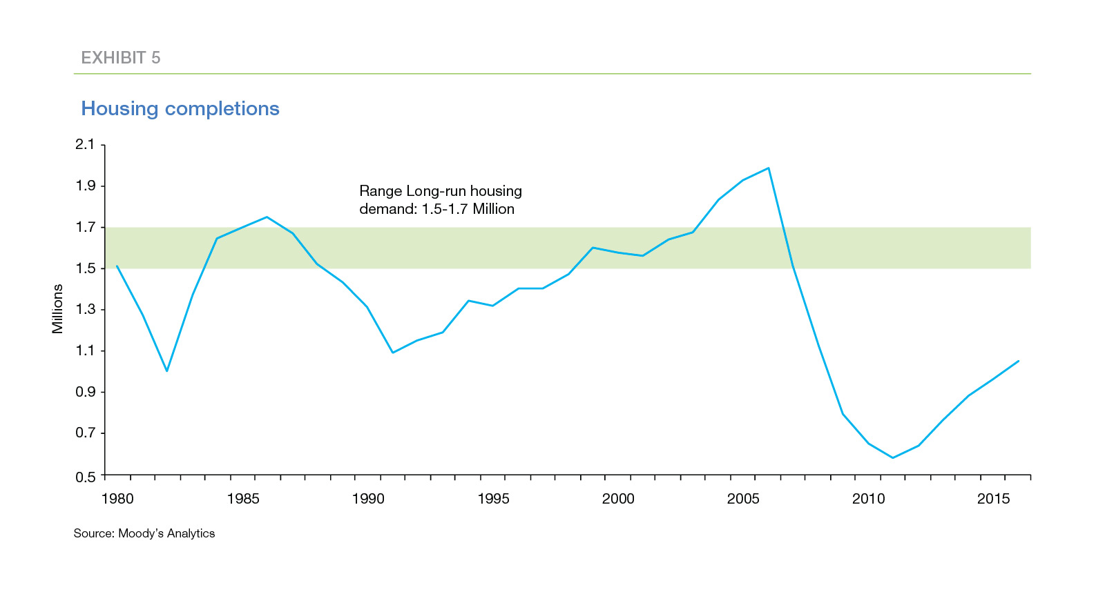
The completion rate for new home construction suggests inventory shortages may persist for several years. It takes a completion rate of 1.5 million to 1.7 million houses per year to cover both household growth and the rate at which older homes become uninhabitable. The completion rate has been increasing since hitting a trough of 0.5 million units in 2011, but most forecasters believe it will take two to three years before the completion rate reaches the stay-even number.
Increasing income inequality may be another reason the increasing PTI ratios are not signaling increased risk. The ratios are based on median home prices and median household income, including those of renters and homeowners who do not plan to move. Increasing PTI ratios may indicate that more-affluent households are purchasing higher-end houses. Affordability may be decreasing for average- and lower-income households, but the households that are purchasing homes may not be stretching financially to do so.
Freddie Mac loan level data provides mixed evidence on this hypothesis. The average loan-level PTI ratio or 3.6 - is lower and less volatile than the traditional PTI measure, while the recalculated outlier threshold is 3.8. Moreover, nine of the ten metros on the watch list no longer exceed their recalculated thresholds. Only Miami still exceeds the outlier threshold (current ratio 3.8 compared to recalculated threshold 3.3).
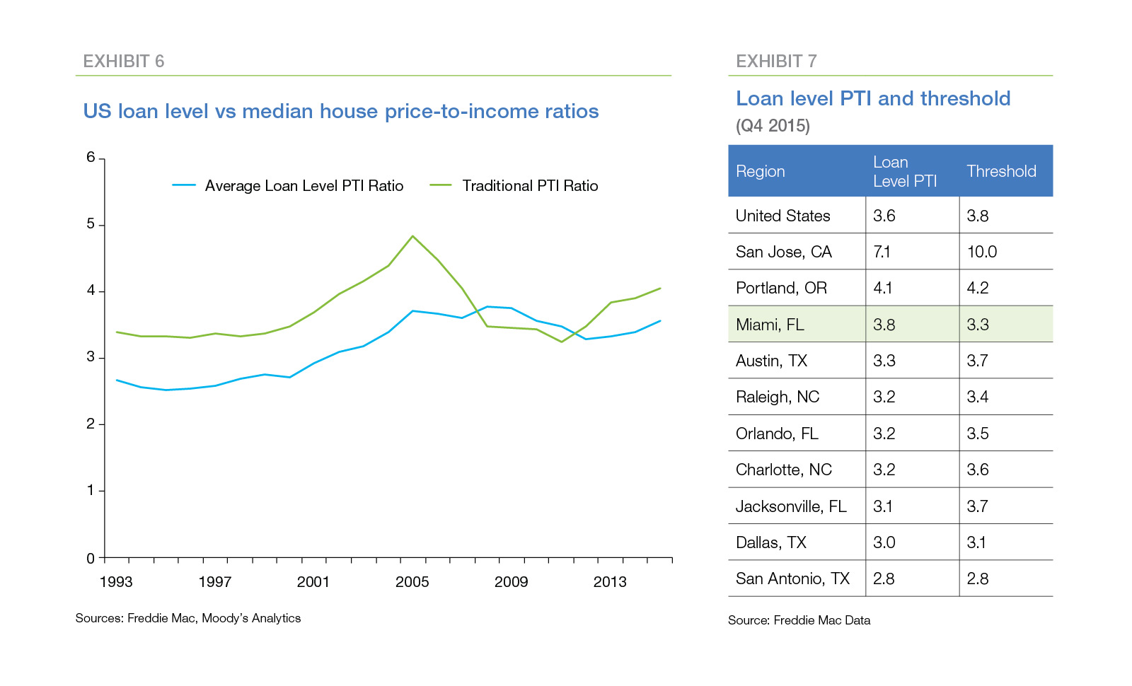
The loan-level ratio has increased noticeably in recent years, and the trend presents an intriguing pattern. Prior to 2001, the national loan-level ratio was relatively flat and averaged about 2.6. From 2001 to 2008, the ratio increased steadily to roughly 3.8. Since then, the ratio has oscillated around this higher level. This pattern suggests that, post-crisis, borrowers are devoting a higher-share of income to housing, on average, than they did historically.
When it comes to the issue of deteriorating credit, outside of a few areas impacted by the oil crisis there are no signs of near-term problems. This can be largely attributed to tightened underwriting standards which have improved credit performance. While underwriting standards are easing neither they nor levels of mortgage fraud or house flipping (except in some select areas) are current causes for concern.
High leverage makes borrowers more vulnerable to house price volatility and also increases the losses suffered by lenders and mortgage insurers when borrowers default. Evidence of increasing leverage is an important warning signal of potential house price weakness.
As can be seen in Exhibit 13, the value of housing increased rapidly in the early 2000s as did mortgage debt as home owners used cash-out refinances and HELOCs to monetize the equity in their homes. The value of housing also has increased rapidly since 2011, however mortgage debt has actually declined slightly. Home owners currently have a near-record amount of equity in their homes which they have not tapped so far.
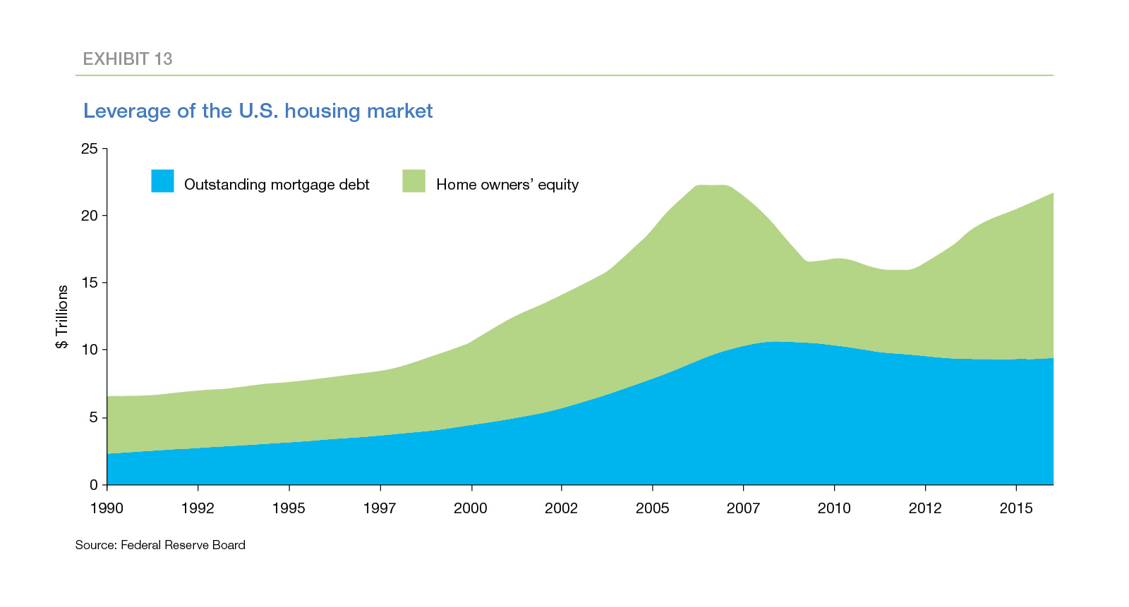
The current level of equity provides homeowners with a substantial cushion against home value fluctuations so a short-term price drop will cause only a small increase in the number of underwater borrowers. This should prevent large scale defaults as homeowners in financial difficulty will generally be able to sell their homes for more than their mortgage balances.
This is not static of course, and homeowners may increase their leverage, especially if wage growth remains stagnant. In that situation, households will be less resilient in the event the economy sags, and house price risk will increase.
Freddie Mac's economists conclude that the difficulty of forecasting home price appreciation and the conflicting signals of various housing metrics make it difficult to assess whether and were house price risk is increasing. The two-stage approach they suggest provides an organized method for assessing the risk by identifying areas where worry may be justified. The first stage identified ten large metro areas with unusually high PTI ratios, however, the second stage failed to produce compelling evidence of increasing house price risk.
Among the three questions asked in the second stage, leverage is likely to be the "canary in the coal mine." As long as leverage remains low, home owners will remain resilient in the face of economic fluctuations. However, if leverage creeps up, home owners' financial cushion will shrink, leaving them more vulnerable to economic shocks.